Welcome to Codidact Meta!
Codidact Meta is the meta-discussion site for the Codidact community network and the Codidact software. Whether you have bug reports or feature requests, support questions or rule discussions that touch the whole network – this is the site for you.
Post History
I'm photosensitive and bright white backgrounds bother me too. Dark-mode themes tend to fail me in other ways, so I usually try to soften the bombardment of bright white pixels instead. In case i...
#1: Initial revision
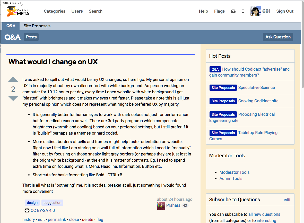
I'm photosensitive and bright white backgrounds bother me too. Dark-mode themes tend to fail me in other ways, so I usually try to soften the bombardment of bright white pixels instead. In case it helps, I'll share my workaround. This is the CSS override I use, with the Stylus add-on, for Codidact sites:
@-moz-document domain("codidact.com") {
.is-12 {background-color: #FDF9F0; }
.is-8-lg {background-color: #FDF9F0; }
.is-4-lg {background-color: #FBEFD1; }
.has-margin-4 {background-color: #FDF9F0; }
}
You can adjust those colors to suit your preferences.
If I recall correctly, there are some transparent backgrounds in play too, and this doesn't catch those. In addition to using Stylus to make per-site CSS adjustments, I've also set a default background color in my browser. You can do this in Chrome and Firefox at least; I don't know about others.
These changes don't get everything; in particular, this doesn't catch the white background in the top bar, but since I'm not usually trying to read lots of text there, that's ok for me.
Here's a screenshot of what this looks like:


