Welcome to Codidact Meta!
Codidact Meta is the meta-discussion site for the Codidact community network and the Codidact software. Whether you have bug reports or feature requests, support questions or rule discussions that touch the whole network – this is the site for you.
Post History
I have been testing the Codidactyl Tour and it looks pretty promising, congratulations on the idea and its implementation. In comments to its announcement I see references about the problems with ...
#5: Post edited
- I have been testing the [Codidactyl Tour](https://meta.codidact.com/tour) and it looks pretty promising, congratulations on the idea and its implementation.
- In comments to [its announcement](https://meta.codidact.com/questions/277016) I see references about the problems with mobile design, so let me post some screenshots to show how it renders on my Mozilla Firefox 68.2.1:
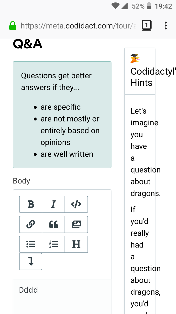
- This is the starting point:
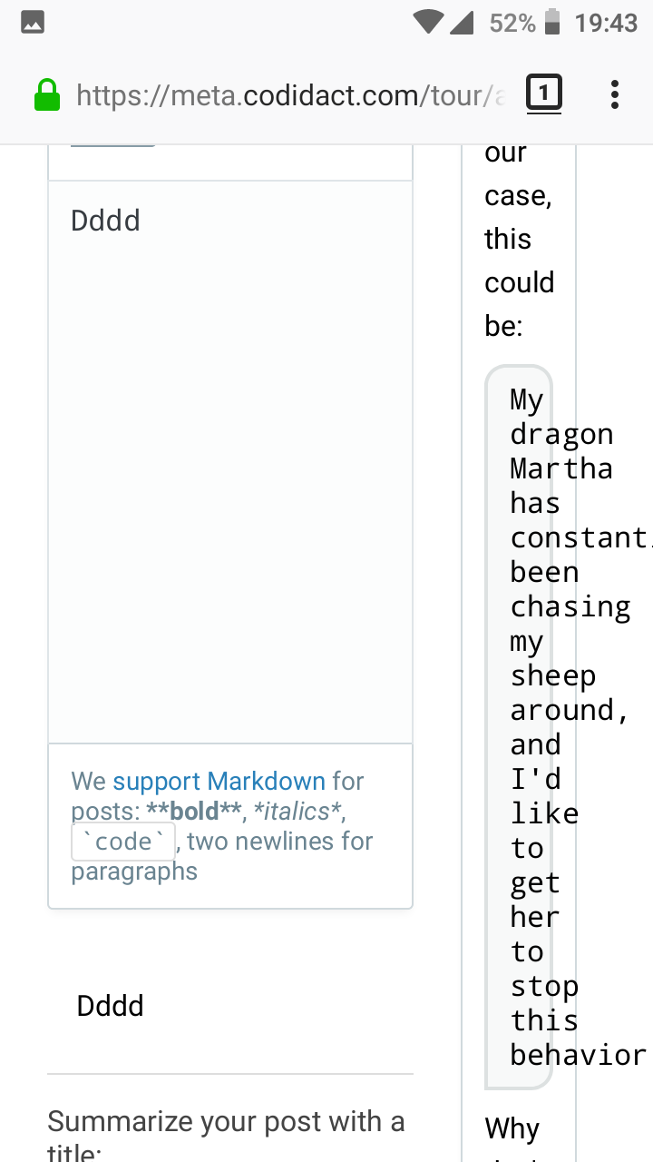
- Then it gets weird:
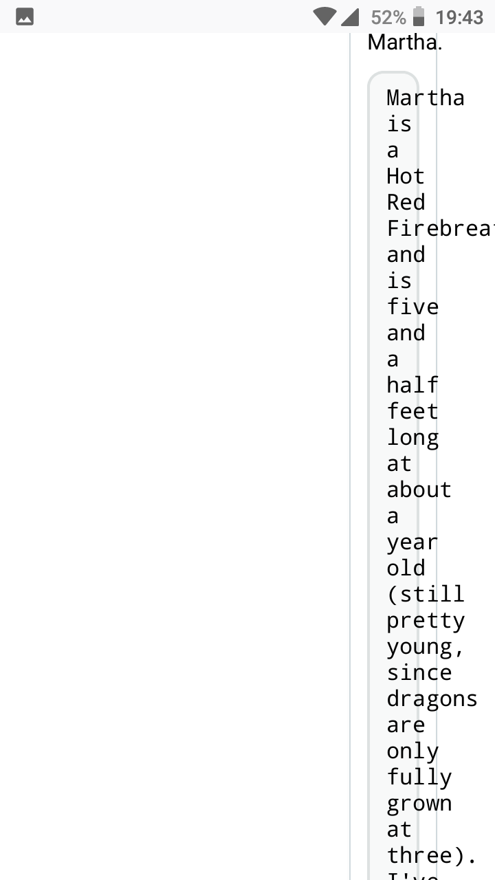
- Finally, it is impossible to read:
- May the tour be displayed in two rows for a better readability?
- I have been testing the [Codidactyl Tour](https://meta.codidact.com/tour) and it looks pretty promising, congratulations on the idea and its implementation.
- In comments to [its announcement](https://meta.codidact.com/questions/277016) I see references about the problems with mobile design, so let me post some screenshots to show how it renders on my Mozilla Firefox 68.2.1:
- This is the starting point:
- > 
- Then it gets weird:
- > 
- Finally, it is impossible to read:
- > 
- May the tour be displayed in two rows for a better readability?
#4: Post edited
Codidactyl tour for new questions on mobile gets harder and harder to read
I have been testing de Codidactyl Tour and it looks pretty promising, congratulations for the idea and its implementation.- In comments to [its announcement](https://meta.codidact.com/questions/277016) I see references about the problems with mobile design, so let me post some screenshots to show how it renders on my Mozilla Firefox 68.2.1:
- This is the starting point:
- 
- Then it gets weird:
- 
And finally it is impossible to read:>- May the tour be displayed in two rows for a better readability?
- I have been testing the [Codidactyl Tour](https://meta.codidact.com/tour) and it looks pretty promising, congratulations on the idea and its implementation.
- In comments to [its announcement](https://meta.codidact.com/questions/277016) I see references about the problems with mobile design, so let me post some screenshots to show how it renders on my Mozilla Firefox 68.2.1:
- This is the starting point:
- 
- Then it gets weird:
- 
- Finally, it is impossible to read:
- 
- May the tour be displayed in two rows for a better readability?
#3: Post edited
I have been testing de Codidactyl Tour and it looks pretty promising, congratulations for the idea and ita implementation.In comments to [its announcement](https://meta.codidact.com/questions/277016) I see referenced about the problems with mobile design, so let me post a couple of screenshots here to show how it renders on my Mozilla Firefox 68.2.1:- This is the starting point:
- 
- Then it gets weird:
- 
And finally impossible to read:- >
- May the tour be displayed in two rows for a better readability?
- I have been testing de Codidactyl Tour and it looks pretty promising, congratulations for the idea and its implementation.
- In comments to [its announcement](https://meta.codidact.com/questions/277016) I see references about the problems with mobile design, so let me post some screenshots to show how it renders on my Mozilla Firefox 68.2.1:
- This is the starting point:
- 
- Then it gets weird:
- 
- And finally it is impossible to read:
- >
- May the tour be displayed in two rows for a better readability?
#2: Post edited
I have been testing de Codidactyl Tour and it looks pretty promising, congratulations for the idea and ita implementation. In comments to [its announcement](https://meta.codidact.com/questions/277016) I see referenced about the problems with mobile design, so let me post a couple of screenshots here to show how it renders on my Mozilla Firefox 68.2.1: This is the starting point:  Then it gets weird:  And finally impossible to read: > May the tour be displayed in two rows for a better readability?
#1: Initial revision
Codidactyl tour for new questions on mobile gets harder and harder to read
I have been testing de Codidactyl Tour and it looks pretty promising, congratulations for the idea and ita implementation. In comments to [its announcement](https://meta.codidact.com/questions/277016) I see referenced about the problems with mobile design, so let me post a couple of screenshots here to show how it renders on my Mozilla Firefox 68.2.1: This is the starting point:  Then it gets weird:  And finally impossible to read: > May the tour be displayed in two rows for a better readability?


