Welcome to Codidact Meta!
Codidact Meta is the meta-discussion site for the Codidact community network and the Codidact software. Whether you have bug reports or feature requests, support questions or rule discussions that touch the whole network – this is the site for you.
Post History
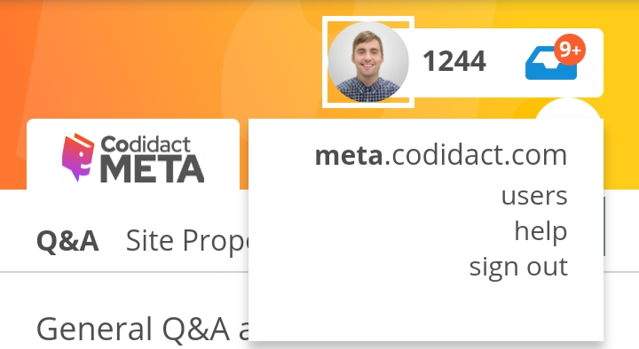
Merge the two top bars. Like in Reddit. Saves space while still allowing plenty of community customization. This is a crude example of what I mean. Position of elements could possibly differ an...
#6: Post edited
by
 Estela
·
2021-06-11T10:34:22Z (almost 4 years ago)
Estela
·
2021-06-11T10:34:22Z (almost 4 years ago)
- Merge the two top bars. Like in Reddit.
- 
- Saves space while still allowing plenty of community customization.
- This is a crude example of what I mean. Position of elements could possibly differ and of course the text I copy pasted is not meant to have a different background.
- 
- Regarding Monica's comment. This is how Reddit looks on a phone in portrait mode:
- 
- Indeed there is not enough space to fit what we can see in a desktop computer. And it is the same in landscape mode despite there being enough space for more. They probably did not think it was worth the effort.
- I have to agree with Monica. A design which works everywhere is more important.
- But are you using the same design everywhere? This is the mockup I get in an Android Samsung XCover 4S model SM-G398FN (1280 x 720) using Chrome:
- 
- 
- The top blue bar is nowhere to be seen and its functionality has been replaced by the circular button with 3 bars.
- If you are using different designs for smartphones than for desktops then for smartphone I would propose this for smartphones:
- 
The triangle pointing down would have the same popup menu as the three bars icon. A three bar icon might be better because it is more common. As seen before Reddit also uses a three bar icon. The icon is not a relevant part of my proposal. The main point is a more compact design without loosing functionality or readability.
- Merge the two top bars. Like in Reddit.
- 
- Saves space while still allowing plenty of community customization.
- This is a crude example of what I mean. Position of elements could possibly differ and of course the text I copy pasted is not meant to have a different background.
- 
- Regarding Monica's comment. This is how Reddit looks on a phone in portrait mode:
- 
- Indeed there is not enough space to fit what we can see in a desktop computer. And it is the same in landscape mode despite there being enough space for more. They probably did not think it was worth the effort.
- I have to agree with Monica. A design which works everywhere is more important.
- But are you using the same design everywhere? This is the mockup I get in an Android Samsung XCover 4S model SM-G398FN (1280 x 720) using Chrome:
- 
- 
- The top blue bar is nowhere to be seen and its functionality has been replaced by the circular button with 3 bars.
- If you are using different designs for smartphones than for desktops then for smartphone I would propose this for smartphones:
- 
- The triangle pointing down would have the same popup menu as the three bars icon. A three bar icon might be better because it is more common. As seen before Reddit also uses a three bar icon. The icon is not a relevant part of my proposal. The main point is a more compact design without loosing functionality or readability.
- And yet another proposal which removes reputation and recovers the hamburger menu. Here the down arrow function is only to change community:
- 
#5: Post edited
by
Estela
·
2021-06-10T21:52:42Z (almost 4 years ago)
- Merge the two top bars. Like in Reddit.
- 
- Saves space while still allowing plenty of community customization.
- This is a crude example of what I mean. Position of elements could possibly differ and of course the text I copy pasted is not meant to have a different background.
- 
- Regarding Monica's comment. This is how Reddit looks on a phone in portrait mode:
- 
- Indeed there is not enough space to fit what we can see in a desktop computer. And it is the same in landscape mode despite there being enough space for more. They probably did not think it was worth the effort.
- I have to agree with Monica. A design which works everywhere is more important.
- But are you using the same design everywhere? This is the mockup I get in an Android Samsung XCover 4S model SM-G398FN (1280 x 720) using Chrome:
- 
- 
- The top blue bar is nowhere to be seen and its functionality has been replaced by the circular button with 3 bars.
If you are using different designs for smartphones than for desktops then for smartphone I would propose:----- Did not look good, doing another try ----
- Merge the two top bars. Like in Reddit.
- 
- Saves space while still allowing plenty of community customization.
- This is a crude example of what I mean. Position of elements could possibly differ and of course the text I copy pasted is not meant to have a different background.
- 
- Regarding Monica's comment. This is how Reddit looks on a phone in portrait mode:
- 
- Indeed there is not enough space to fit what we can see in a desktop computer. And it is the same in landscape mode despite there being enough space for more. They probably did not think it was worth the effort.
- I have to agree with Monica. A design which works everywhere is more important.
- But are you using the same design everywhere? This is the mockup I get in an Android Samsung XCover 4S model SM-G398FN (1280 x 720) using Chrome:
- 
- 
- The top blue bar is nowhere to be seen and its functionality has been replaced by the circular button with 3 bars.
- If you are using different designs for smartphones than for desktops then for smartphone I would propose this for smartphones:
- 
- The triangle pointing down would have the same popup menu as the three bars icon. A three bar icon might be better because it is more common. As seen before Reddit also uses a three bar icon. The icon is not a relevant part of my proposal. The main point is a more compact design without loosing functionality or readability.
#4: Post edited
by
Estela
·
2021-06-10T21:30:57Z (almost 4 years ago)
- Merge the two top bars. Like in Reddit.
- 
- Saves space while still allowing plenty of community customization.
- This is a crude example of what I mean. Position of elements could possibly differ and of course the text I copy pasted is not meant to have a different background.
- 
- Regarding Monica's comment. This is how Reddit looks on a phone in portrait mode:
- 
- Indeed there is not enough space to fit what we can see in a desktop computer. And it is the same in landscape mode despite there being enough space for more. They probably did not think it was worth the effort.
- I have to agree with Monica. A design which works everywhere is more important.
- But are you using the same design everywhere? This is the mockup I get in an Android Samsung XCover 4S model SM-G398FN (1280 x 720) using Chrome:
- 
- 
- The top blue bar is nowhere to be seen and its functionality has been replaced by the circular button with 3 bars.
- If you are using different designs for smartphones than for desktops then for smartphone I would propose:
- ----- Did not look good, doing another try ----
#3: Post edited
by
Estela
·
2021-06-10T21:28:53Z (almost 4 years ago)
- Merge the two top bars. Like in Reddit.
- 
- Saves space while still allowing plenty of community customization.
- This is a crude example of what I mean. Position of elements could possibly differ and of course the text I copy pasted is not meant to have a different background.

- Merge the two top bars. Like in Reddit.
- 
- Saves space while still allowing plenty of community customization.
- This is a crude example of what I mean. Position of elements could possibly differ and of course the text I copy pasted is not meant to have a different background.
- 
- Regarding Monica's comment. This is how Reddit looks on a phone in portrait mode:
- 
- Indeed there is not enough space to fit what we can see in a desktop computer. And it is the same in landscape mode despite there being enough space for more. They probably did not think it was worth the effort.
- I have to agree with Monica. A design which works everywhere is more important.
- But are you using the same design everywhere? This is the mockup I get in an Android Samsung XCover 4S model SM-G398FN (1280 x 720) using Chrome:
- 
- 
- The top blue bar is nowhere to be seen and its functionality has been replaced by the circular button with 3 bars.
- If you are using different designs for smartphones than for desktops then for smartphone I would propose:
- 
#2: Post edited
by
Estela
·
2021-06-10T09:18:27Z (almost 4 years ago)
- Merge the two top bars. Like in Reddit.
- 
- Saves space while still allowing plenty of community customization.
This is a crude example of what I mean. Position of elements could possibly differ and our course the text I copy pasted is not meant to have a different background.- 
- Merge the two top bars. Like in Reddit.
- 
- Saves space while still allowing plenty of community customization.
- This is a crude example of what I mean. Position of elements could possibly differ and of course the text I copy pasted is not meant to have a different background.
- 
#1: Initial revision
by
Estela
·
2021-06-10T09:16:55Z (almost 4 years ago)
Merge the two top bars. Like in Reddit.  Saves space while still allowing plenty of community customization. This is a crude example of what I mean. Position of elements could possibly differ and our course the text I copy pasted is not meant to have a different background. 