Welcome to Codidact Meta!
Codidact Meta is the meta-discussion site for the Codidact community network and the Codidact software. Whether you have bug reports or feature requests, support questions or rule discussions that touch the whole network – this is the site for you.
Post History
I looked at the mockup on my phone. At default zoom this is what I see (in Chrome, in case it matters): Screenshot Focusing on the question list (for this answer): With the amount of ...
#2: Post edited
by
 Moshi
·
2021-06-11T20:53:51Z (almost 4 years ago)
Moshi
·
2021-06-11T20:53:51Z (almost 4 years ago)
Hid away the massive image in collapsible section
- I looked at the mockup on my phone. At default zoom this is what I see (in Chrome, in case it matters):
- 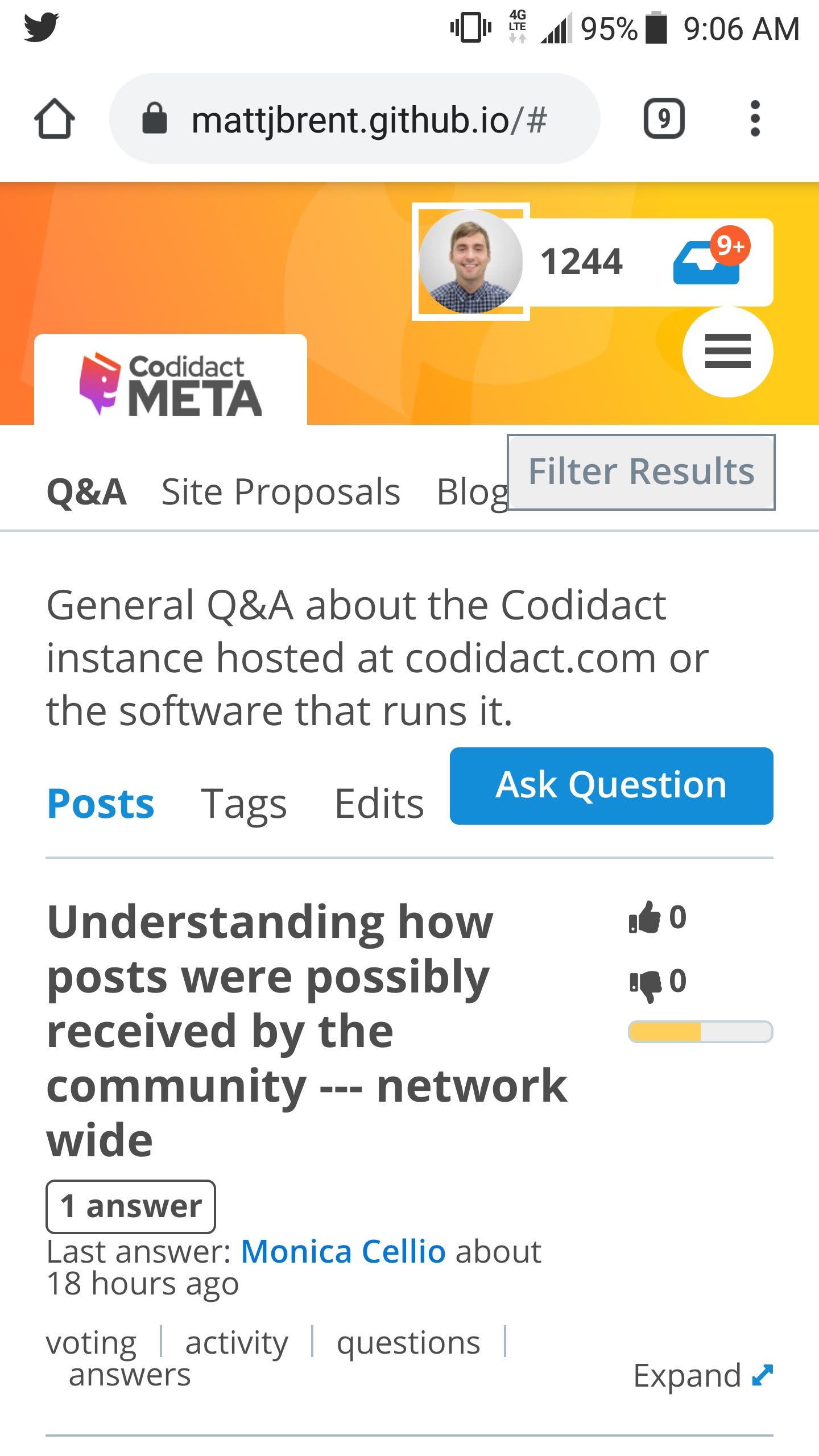
- Focusing on the **question list** (for this answer):
- - With the amount of stuff at the top and the size of the titles, I see only one question. That seems unfortunate.
- - Part of that is due to the title width being constrained. For a small screen could we do something else with the currently horizontal thermometer? Maybe make it vertical, or smaller, or collapse down to just color (so you get only three states and can't see how green or red something is)? I'm not sure what would be best here, but I'd like titles to have more of the width.
- - From the way the tags, "N answers", and "last activity" parts are flowing, it looks like reducing the width of that area would also improve these. I guess we can't flow text into that empty space under the thermometer? Another reason to reduce the width it consumes.
- - Space is tight on the "last activity" line; "~" instead of "about" might make the difference.
- - Another area grabbing space is the category description. (This is true for the current design too.) Especially on a smaller screen, and perhaps more generally, I wonder if we should make that collapsible -- maybe show it until the user dismisses it (so you'd need a cookie, I think), and when it's dismissed, add something that the user can tap/click to see it again. Even though it's at a different "level", maybe the hamburger menu is an ok place to add "category description" to toggle it back on? Or maybe some sort of TBD icon on the category row?
- I looked at the mockup on my phone. At default zoom this is what I see (in Chrome, in case it matters):
- <details>
- <summary>Screenshot</summary>
- 
- </details>
- Focusing on the **question list** (for this answer):
- - With the amount of stuff at the top and the size of the titles, I see only one question. That seems unfortunate.
- - Part of that is due to the title width being constrained. For a small screen could we do something else with the currently horizontal thermometer? Maybe make it vertical, or smaller, or collapse down to just color (so you get only three states and can't see how green or red something is)? I'm not sure what would be best here, but I'd like titles to have more of the width.
- - From the way the tags, "N answers", and "last activity" parts are flowing, it looks like reducing the width of that area would also improve these. I guess we can't flow text into that empty space under the thermometer? Another reason to reduce the width it consumes.
- - Space is tight on the "last activity" line; "~" instead of "about" might make the difference.
- - Another area grabbing space is the category description. (This is true for the current design too.) Especially on a smaller screen, and perhaps more generally, I wonder if we should make that collapsible -- maybe show it until the user dismisses it (so you'd need a cookie, I think), and when it's dismissed, add something that the user can tap/click to see it again. Even though it's at a different "level", maybe the hamburger menu is an ok place to add "category description" to toggle it back on? Or maybe some sort of TBD icon on the category row?
#1: Initial revision
by
 Monica Cellio
·
2021-06-11T01:43:31Z (almost 4 years ago)
Monica Cellio
·
2021-06-11T01:43:31Z (almost 4 years ago)
I looked at the mockup on my phone. At default zoom this is what I see (in Chrome, in case it matters):  Focusing on the **question list** (for this answer): - With the amount of stuff at the top and the size of the titles, I see only one question. That seems unfortunate. - Part of that is due to the title width being constrained. For a small screen could we do something else with the currently horizontal thermometer? Maybe make it vertical, or smaller, or collapse down to just color (so you get only three states and can't see how green or red something is)? I'm not sure what would be best here, but I'd like titles to have more of the width. - From the way the tags, "N answers", and "last activity" parts are flowing, it looks like reducing the width of that area would also improve these. I guess we can't flow text into that empty space under the thermometer? Another reason to reduce the width it consumes. - Space is tight on the "last activity" line; "~" instead of "about" might make the difference. - Another area grabbing space is the category description. (This is true for the current design too.) Especially on a smaller screen, and perhaps more generally, I wonder if we should make that collapsible -- maybe show it until the user dismisses it (so you'd need a cookie, I think), and when it's dismissed, add something that the user can tap/click to see it again. Even though it's at a different "level", maybe the hamburger menu is an ok place to add "category description" to toggle it back on? Or maybe some sort of TBD icon on the category row?