Welcome to Codidact Meta!
Codidact Meta is the meta-discussion site for the Codidact community network and the Codidact software. Whether you have bug reports or feature requests, support questions or rule discussions that touch the whole network – this is the site for you.
Post History
I was checking UI/UX in android. I had marked what isn't looking well right now. Look at following picture. In Desktop, we can see lot of sites link in Desktop. While, android is only showing...
#1: Initial revision
I was checking UI/UX in android. I had marked what isn't looking well right now. > <br/><br/> >Look at following picture. In Desktop, we can see lot of sites link in Desktop. While, android is only showing Codidact Meta. <br/><br/> >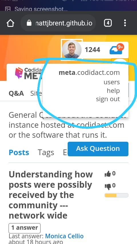 So, there's some issue is available in above UI. The UI is completely looking good in Iphone 6,7,8 Plus IOS 11. 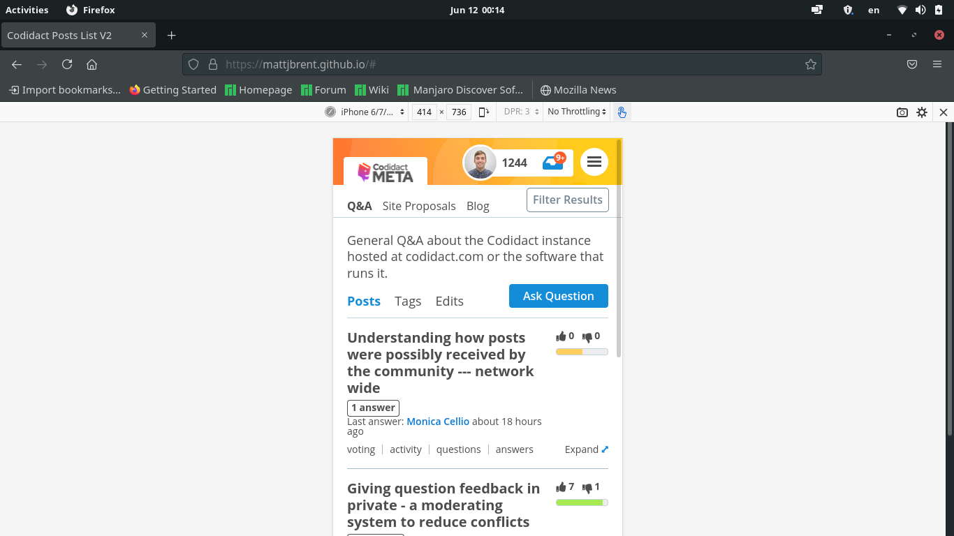 <br/> I had earlier worked on it (maybe, 2 months ago). I had made some changes. He didn't response to those [PR](https://github.com/codidact/feature-development/pull/19). So, I am implementing it here. I had [messaged in Discord](https://discord.com/channels/634104110131445811/634104110131445815/840493744004268034) also. He had made some more changes after I PR (In few moments, he changed the UI lot more that's why I didn't message). Here's how the UI looks like 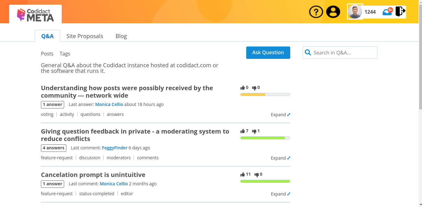 **I didn't have any better icon that's why I just used those.** If people likes the UI. Than, I will work on it again :) . <hr/> The one last thing I want in this UI that is **color**. The color isn't looking beautiful. But, when I use Dark Reader(Mithical mentioned in Discord) the top bar is looking good. But, without Dark Mode it's very dirty (That's what I think. It may be beautiful for someone else also). 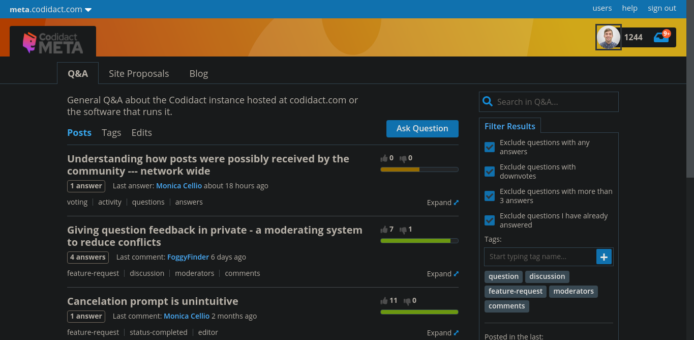 That's why I think if he changes the color of top bar than it may be good.


