Welcome to Codidact Meta!
Codidact Meta is the meta-discussion site for the Codidact community network and the Codidact software. Whether you have bug reports or feature requests, support questions or rule discussions that touch the whole network – this is the site for you.
What does the logo of each Codidact site represent?
Learned about Codidact, and bringing this alive.
A logo has a visual representation of what brand is being held, where some have clear meanings, while others don't. There are some sites on the Codidact Q&A network that are based on different topics. From the question topics to the identity of each site's logo, what does it represent?
Since Codidact has no favicon-sized logos, I made my own on the answer.
1 answer
Seriously!? Unlike Elsewhere, site logos on Codidact were chosen to be widely recognizable as belonging to the particular subject, even by people that aren't familiar with the subject. The logo, like the site name, is outward-facing. As such, it makes sense to choose them for good recognition by outsiders.
As such, many of the logos really should be obvious. Nevertheless, here are descriptions of some of them:
The "T" is styled like the cross symbol, a very common emblem for christianity. It symbolizes the cross that Christ supposedly died on.
That's supposed to be a frying pan behind the "C".
That's the standard schematic symbol for a common type of transistor. While those not familiar with electronics might not recognize it, hopefully it will at least look like an "electrical thingy" to others. Of course the words "Electrical Engineering" help greatly with that.
I'm not a jew, but even I know that's a minorah. It's used to hold candles, and is a common symbol associated with judaism.
The penguin has become the common symbol for Linux. I think it has something to do with Linus Torvalds having a plastic penguin next to his monitor, but I could be quite off on that.
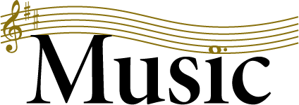
That's a somewhat whimsical representation of how music is written. The reason I say whimsical is because in reality it wouldn't be wavy like that. Still, it's clear enough to anyone that has ever looked at sheet music.
The lines on the "d" are meant to look like a tree. I'm not sure what the extra stuff on the "O" is supposed to be.
Clearly that's meant to look like a camera.
This is meant to invoke the popular image of electrons orbiting a nucleus. A symbol like this was often used for things related to nuclear physics in the past, so should be reasonably recognizable by the public. Electrons aren't really little solid blobs that travel in defined orbits like that, but it's still something many people will recognize.
Obviously those are flasks. The point is to invoke the notion of "scientific stuff" or "people mucking about in a laboratory" to the general public.


2 comment threads