Welcome to Codidact Meta!
Codidact Meta is the meta-discussion site for the Codidact community network and the Codidact software. Whether you have bug reports or feature requests, support questions or rule discussions that touch the whole network – this is the site for you.
Post History
One thing one realizes quickly when for example visiting meta.codidact.com is that it's a site about Q&A. The reason is that for example it is written twice: But is this duplication really n...
#3: Post edited
Should the category name not be shown twice on the category headers?
- Should the active category name not be shown twice on the categories header?
#2: Post edited
- One thing one realizes quickly when for example visiting meta.codidact.com is that it's a site about Q&A. The reason is that for example it is written twice:
- 
- But is this duplication really necessary? What is the purpose of it? Usually duplications are avoided.
- It's the category name that is printed on the left below the tabs again. But the active tab is already visible by the different background and one could make it even more visible.
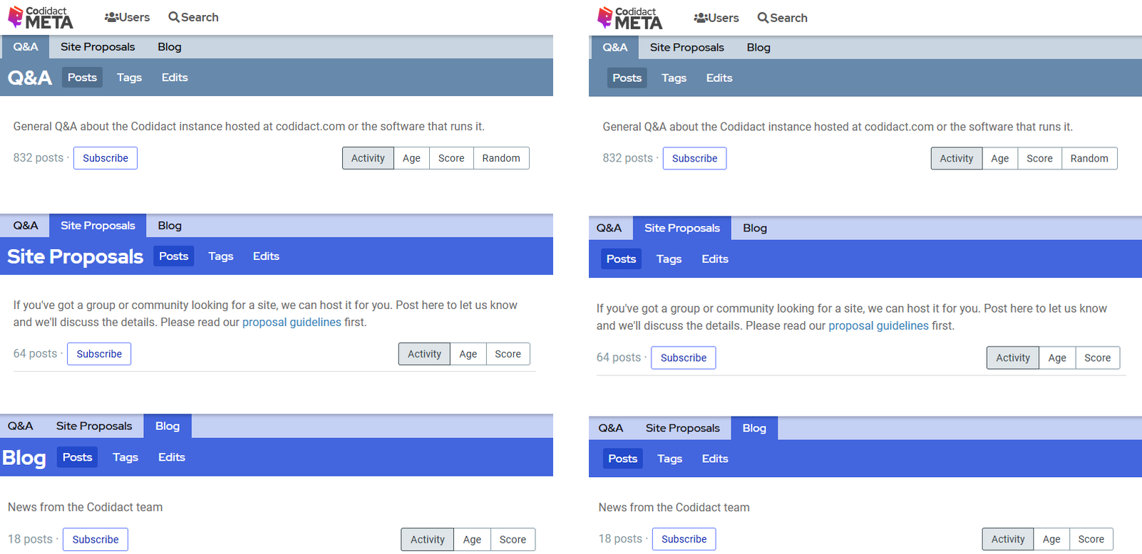
I tried to remove the duplication (see below) and already like this it looks better, I think. Also the "Posts, Tags, Edits" would then start always at the same position on screen.- 
- If needed, one could also increase the font size of the category names in the tabs or make the active category also with a higher font weight while at the same time decreasing the height of the "Posts, ..." row a bit. This change would not be much effort.
- What do you think?
- One thing one realizes quickly when for example visiting meta.codidact.com is that it's a site about Q&A. The reason is that for example it is written twice:
- 
- But is this duplication really necessary? What is the purpose of it? Usually duplications are avoided.
- It's the category name that is printed on the left below the tabs again. But the active tab is already visible by the different background and one could make it even more visible.
- I tried to remove the duplication (see below, current state on the left) and already without the repetition it looks better, I'd say. Also the "Posts, Tags, Edits" would then start always at the same position on screen.
- 
- If needed, one could also increase the font size of the category names in the tabs or make the active category also with a higher font weight while at the same time decreasing the height of the "Posts, ..." row a bit. This change would not be much effort.
- What do you think?
#1: Initial revision
Should the category name not be shown twice on the category headers?
One thing one realizes quickly when for example visiting meta.codidact.com is that it's a site about Q&A. The reason is that for example it is written twice:  But is this duplication really necessary? What is the purpose of it? Usually duplications are avoided. It's the category name that is printed on the left below the tabs again. But the active tab is already visible by the different background and one could make it even more visible. I tried to remove the duplication (see below) and already like this it looks better, I think. Also the "Posts, Tags, Edits" would then start always at the same position on screen.  If needed, one could also increase the font size of the category names in the tabs or make the active category also with a higher font weight while at the same time decreasing the height of the "Posts, ..." row a bit. This change would not be much effort. What do you think?


