Welcome to Codidact Meta!
Codidact Meta is the meta-discussion site for the Codidact community network and the Codidact software. Whether you have bug reports or feature requests, support questions or rule discussions that touch the whole network – this is the site for you.
Post History
I think that it would be better to give the users the option to fix the navigation bar at the top, just like in Stack Overflow. If a user receives a notification, and at that time they are busy re...
#5: Post edited
Navigation bar optionally fixed at the top
- Make navigation bar optionally fixed at the top
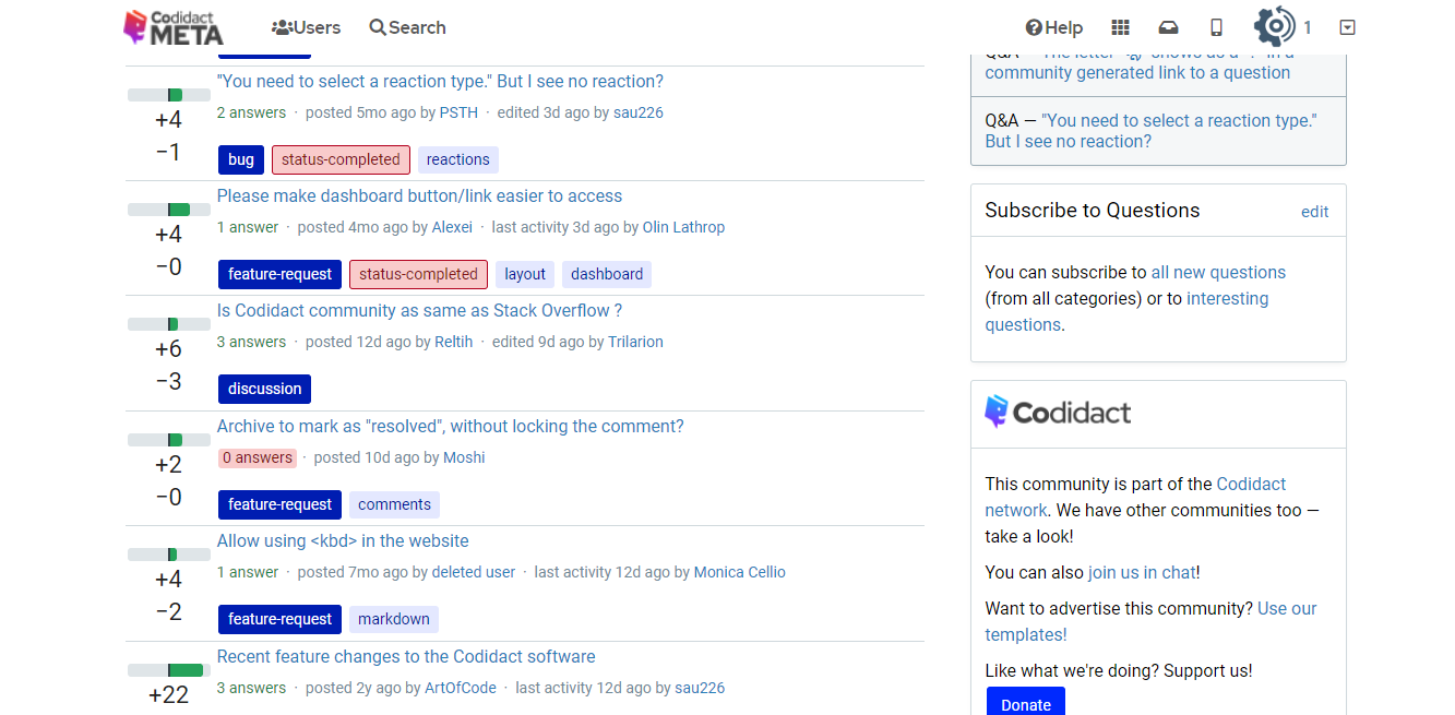
I think that it would be better to give the users the option to fix the navigation bar at the top, just like in SO. If a user receives a notification, and at that time they are busy reading or writing an answer, they can see it immediately without the need to scroll up to the top of the page every now and then to check their inbox.- Illustration:
- 
- In terms of code, this may translate to something similar:
- ```
- nav {
- position: absolute;
- /* etc. */
- }
- ```
- What do you think?
- I think that it would be better to give the users the option to fix the navigation bar at the top, just like in Stack Overflow.
- If a user receives a notification, and at that time they are busy reading or writing an answer, they would be able to see it immediately without the need to scroll up to the top of the page every now and then to check their inbox.
- Illustration:
- 
- In terms of code, this may translate to something similar:
- ```
- nav {
- position: absolute;
- /* etc. */
- }
- ```
- What do you think?
#3: Post edited
Navigation bar should be fixed at the top
- Navigation bar optionally fixed at the top
I think that it would be more practical to fix the navigation bar at the top, just like in SO. If a user receives a notification, and at that time they are busy reading or writing an answer, they see it immediately without the need to scroll up to the top of the page every now and then to check their inbox.- Illustration:
- 
- In terms of code, this may translate to something similar:
- ```
- nav {
- position: absolute;
- /* etc. */
- }
- ```
- What do you think?
- I think that it would be better to give the users the option to fix the navigation bar at the top, just like in SO. If a user receives a notification, and at that time they are busy reading or writing an answer, they can see it immediately without the need to scroll up to the top of the page every now and then to check their inbox.
- Illustration:
- 
- In terms of code, this may translate to something similar:
- ```
- nav {
- position: absolute;
- /* etc. */
- }
- ```
- What do you think?
#2: Post edited
I think that it would be more practical to fix the navigation bar at the top, just like in SO. If a user receives a notification, and at that time he is busy reading or writing an answer, they see it immediately without the need to scroll up to the top of the page every now and then to check their inbox.- Illustration:
- 
- In terms of code, this may translate to something similar:
- ```
- nav {
- position: absolute;
- /* etc. */
- }
- ```
- What do you think?
- I think that it would be more practical to fix the navigation bar at the top, just like in SO. If a user receives a notification, and at that time they are busy reading or writing an answer, they see it immediately without the need to scroll up to the top of the page every now and then to check their inbox.
- Illustration:
- 
- In terms of code, this may translate to something similar:
- ```
- nav {
- position: absolute;
- /* etc. */
- }
- ```
- What do you think?
#1: Initial revision
Navigation bar should be fixed at the top
I think that it would be more practical to fix the navigation bar at the top, just like in SO. If a user receives a notification, and at that time he is busy reading or writing an answer, they see it immediately without the need to scroll up to the top of the page every now and then to check their inbox.
Illustration:

In terms of code, this may translate to something similar:
```
nav {
position: absolute;
/* etc. */
}
```
What do you think?


