Communities

Writing
Writing
Codidact Meta
Codidact Meta
The Great Outdoors
The Great Outdoors
Photography & Video
Photography & Video
Scientific Speculation
Cooking
Cooking
Electrical Engineering
Judaism
Judaism
Languages & Linguistics
Software Development
Mathematics
Mathematics
Christianity
Christianity
Code Golf
Code Golf
Music
Music
Physics
Physics
Linux Systems
Linux Systems
Power Users
Power Users
Tabletop RPGs
Tabletop RPGs
Community Proposals
Community Proposals
tag:snake search within a tag
answers:0 unanswered questions
user:xxxx search by author id
score:0.5 posts with 0.5+ score
"snake oil" exact phrase
votes:4 posts with 4+ votes
created:<1w created < 1 week ago
post_type:xxxx type of post
Search help
Notifications
Mark all as read See all your notifications »
Q&A

Welcome to Codidact Meta!

Codidact Meta is the meta-discussion site for the Codidact community network and the Codidact software. Whether you have bug reports or feature requests, support questions or rule discussions that touch the whole network – this is the site for you.

Post History

60%
+1 −0
Q&A Main and subheadings are almost the same size, but not in the edit preview

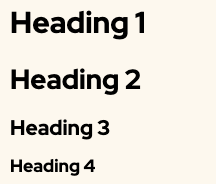
I think the problem is in the relative sizes. Here's what I see -- and the first two looked the same to me too until I took a really close look: The first one is large, the second one is slight...
posted 2y ago by Monica Cellio‭

Answer
#1: Initial revision by user avatar Monica Cellio‭ · 2022-10-25T02:31:46Z (about 2 years ago)
I think the problem is in the *relative* sizes.  Here's what I see -- and the first two looked the same to me too until I took a really close look:

![screen shot from post](https://meta.codidact.com/uploads/dPAh7hKdUFipvbg1cwdvroGM)

The first one is large, the second one is *slightly* smaller, barely, and then there's a huge size difference between the second and third.  The fourth is then visibly smaller than the third.  I think if we dropped the size of the second one a bit, we could produce a smoother "gradient".

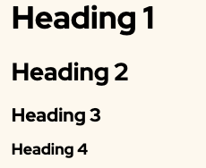
In contrast to what shows on this page, here's how the editor renders it:
![editor screen shot](https://meta.codidact.com/uploads/aBv9jY7JUq2gm3FcKC4XqqYf)

That's much better -- 2 is clearly smaller than 1.  It doesn't look completely smooth to my eye, but the four sizes are clearly different -- good enough.