Welcome to Codidact Meta!
Codidact Meta is the meta-discussion site for the Codidact community network and the Codidact software. Whether you have bug reports or feature requests, support questions or rule discussions that touch the whole network – this is the site for you.
Post History
When viewing a post edit diff on mobile the side by side format for before and after makes each side very narrow in portrait mode. Text wrapping appears to only happen between words, leaving longer...
#1: Initial revision
Broken edit diffs on narrow mobile screens
When viewing a post edit diff on mobile the side by side format for before and after makes each side very narrow in portrait mode. Text wrapping appears to only happen between words, leaving longer words overflowing from the left hand (before) side and extending behind the right hand (after) side, obscuring part of the word: 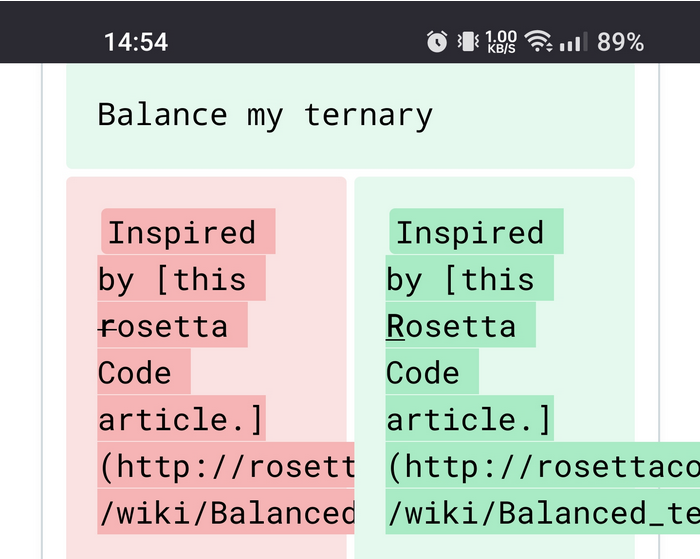 This looks much better in landscape mode: 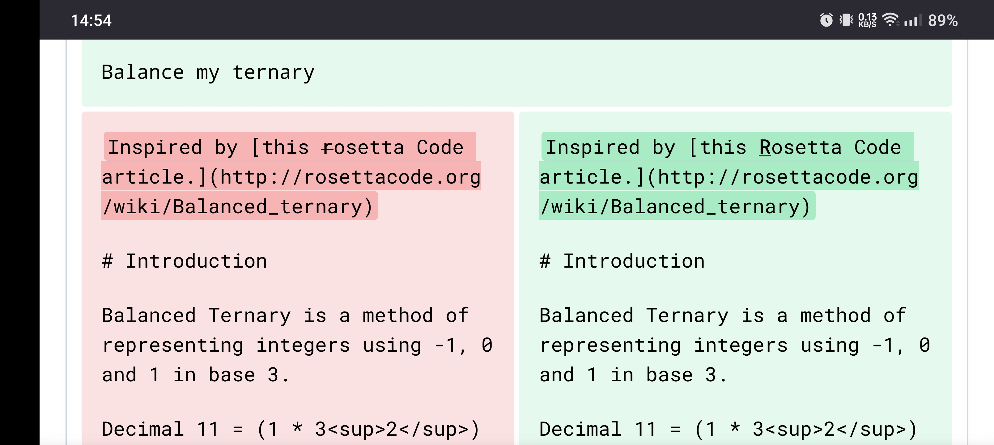 ## Possibilities What would be the best way to improve this situation? ### Wrapping mid-word Allow wrapping mid-word so that long words do not exceed the available width. 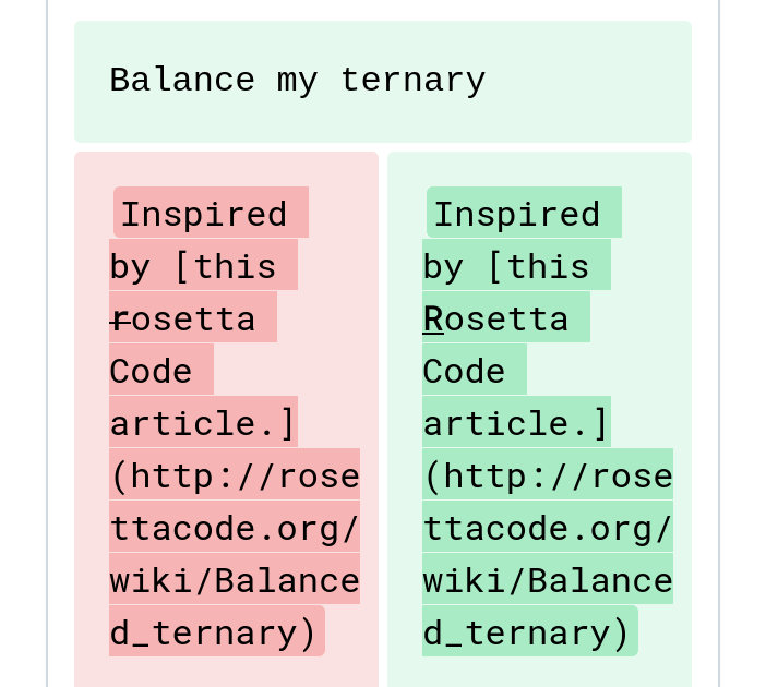 I have avoided hyphens for the word breaks as this is the middle of a URL, but the red and green highlighting makes it clear that the earlier lines end in a space whereas these mid-word line endings have no space. ### Suggest landscape Have a dismissable note above the diff recommending switching to landscape mode. The note can automatically appear when the width is too narrow to comfortably display the diff side by side. 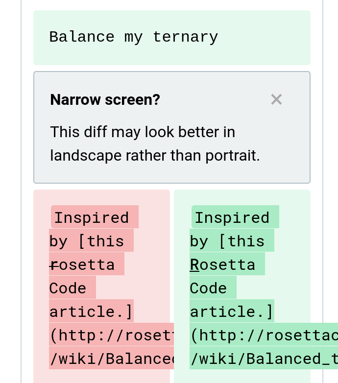 ### Vertical rather than horizontal When the width is below some threshold, display the before and after versions above and below, rather than left and right, so they both have twice as much width. 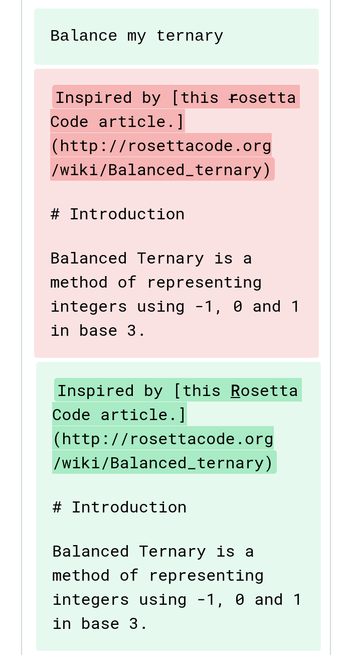 ### Inline diff Switch to inline diff instead of side by side diff when the width is below some threshold. #### Individual letters shown as inline diff 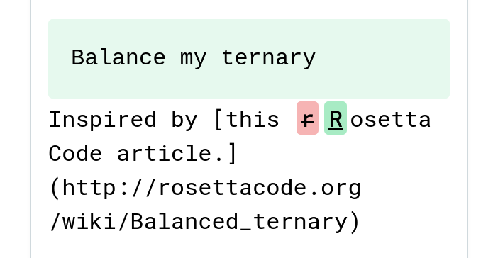 #### Containing word shown as inline diff 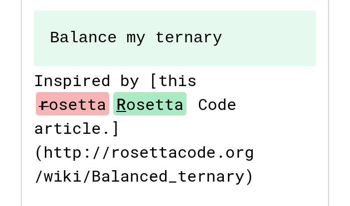 ### Unified diff (interleaved before and after lines) Switch to unified diff instead of side by side diff when the width is below some threshold (full width content with an edited line showing twice, in red for the before and then in green for the after). 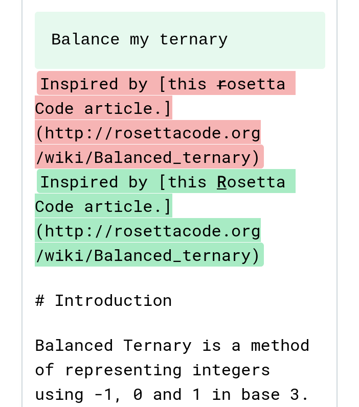 ### Combination / choice Some combination of several of these approaches, or the option to switch between them. ## Example of what GitHub calls "split" and "unified" diffs ### Split diff This causes a lot of wrapping onto the next line with a narrow screen. 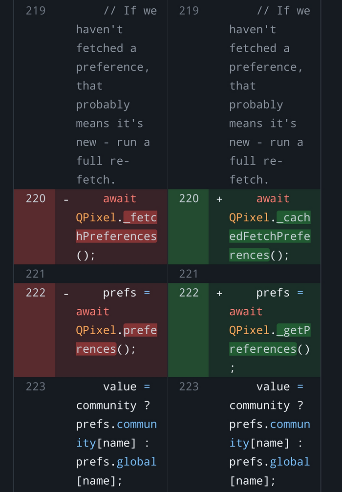 ### Unified diff This reduces the amount of wrapping with a narrow screen. 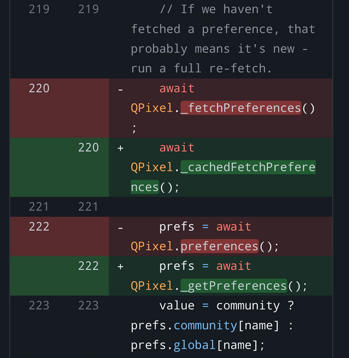 Note that these GitHub diffs also allow the text wrapping to break long words (in both split diff and unified diff). Since we do not need to display line numbers, hopefully we can make even better use of the space with a unified diff. How does this compare with inline diffs? What are your preferences?


