Welcome to Codidact Meta!
Codidact Meta is the meta-discussion site for the Codidact community network and the Codidact software. Whether you have bug reports or feature requests, support questions or rule discussions that touch the whole network – this is the site for you.
Post History
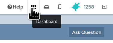
There is a dashboard available from the top right of the screen: This shows the categories for each Codidact community, along with an indicator for any categories that have new activity: Howe...
#3: Post edited
by
 Monica Cellio
·
2023-08-03T02:15:06Z (almost 2 years ago)
Monica Cellio
·
2023-08-03T02:15:06Z (almost 2 years ago)
#2: Post edited
by
 trichoplax
·
2023-05-21T23:43:16Z (about 2 years ago)
trichoplax
·
2023-05-21T23:43:16Z (about 2 years ago)
Mention bar is not interactive
- There is a [dashboard] available from the top right of the screen:
- 
- This shows the categories for each Codidact community, along with an indicator for any categories that have new activity:
- 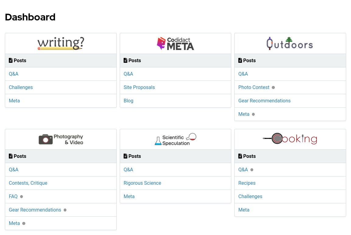
However, it also contains a grey bar saying "Posts" at the top of each category list. Is this redundant? Would it be just as intuitive with that bar omitted? This is what it would look like:- 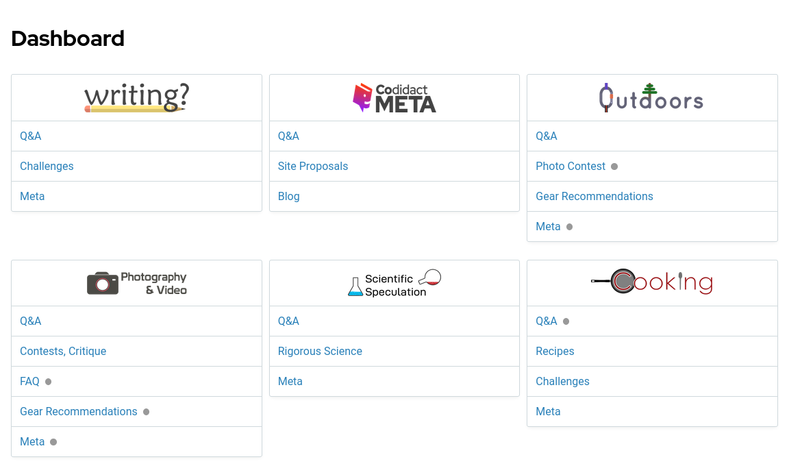
- This might be even more useful on mobile where there is only room for a single column, and saving the vertical space allows more information to fit on the screen:
- 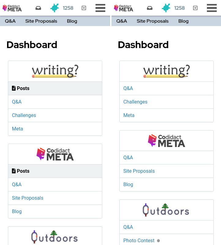
- Now 2 additional categories fit on the screen, and I personally find it less cluttered.
- [dashboard]: https://meta.codidact.com/dashboard
- There is a [dashboard] available from the top right of the screen:
- 
- This shows the categories for each Codidact community, along with an indicator for any categories that have new activity:
- 
- However, it also contains a grey bar saying "Posts" at the top of each category list. It is not interactive (doesn't link anywhere else) and doesn't appear to be needed. Is this redundant? Would it be just as intuitive with that bar omitted? This is what it would look like:
- 
- This might be even more useful on mobile where there is only room for a single column, and saving the vertical space allows more information to fit on the screen:
- 
- Now 2 additional categories fit on the screen, and I personally find it less cluttered.
- [dashboard]: https://meta.codidact.com/dashboard
#1: Initial revision
by
trichoplax
·
2023-05-21T23:40:34Z (about 2 years ago)
Redundant "Posts" heading on every community in the dashboard
There is a [dashboard] available from the top right of the screen:  This shows the categories for each Codidact community, along with an indicator for any categories that have new activity:  However, it also contains a grey bar saying "Posts" at the top of each category list. Is this redundant? Would it be just as intuitive with that bar omitted? This is what it would look like:  This might be even more useful on mobile where there is only room for a single column, and saving the vertical space allows more information to fit on the screen:  Now 2 additional categories fit on the screen, and I personally find it less cluttered. [dashboard]: https://meta.codidact.com/dashboard