Welcome to Codidact Meta!
Codidact Meta is the meta-discussion site for the Codidact community network and the Codidact software. Whether you have bug reports or feature requests, support questions or rule discussions that touch the whole network – this is the site for you.
Post History
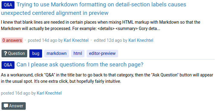
Currently, when I look at search results, or the list of posts on my user profile, I get results that look like: I have two objections. In my view: Answers should show the tags of the corre...
#1: Initial revision
Improved layout for individual search results
Currently, when I look at search results, or the list of posts on my user profile, I get results that look like:  I have two objections. In my view: * Answers should show the tags of the corresponding question on the bottom line. This is how I'm accustomed to it working from SE, and it offers useful context to understand the answer summary at a glance. * The "Question" and "Answer" labels should appear on the top line instead of the bottom line. This is more useful, because it's easy to forget in searches to filter to questions only or answers only. It's also more consistent, because the "Question" label and (as here) the "Q&A" label are the same kind of thing - information about the *kind* of post, which does *not* link to separate pages (i.e., they are only labels and not buttons). By contrast, the tag buttons do link to pages about the corresponding tag, and are information about the *content* of the post. (I am agnostic as to the order of the Question/Answer label and the Q&A/Meta/etc. label.)


