Welcome to Codidact Meta!
Codidact Meta is the meta-discussion site for the Codidact community network and the Codidact software. Whether you have bug reports or feature requests, support questions or rule discussions that touch the whole network – this is the site for you.
Post History
From a comment thread page, pressing "flag" on a comment results in a pop up panel with a text input and a "Flag" button. On mobile, in portrait mode, this pop up panel overlaps the left hand edge ...
#2: Post edited
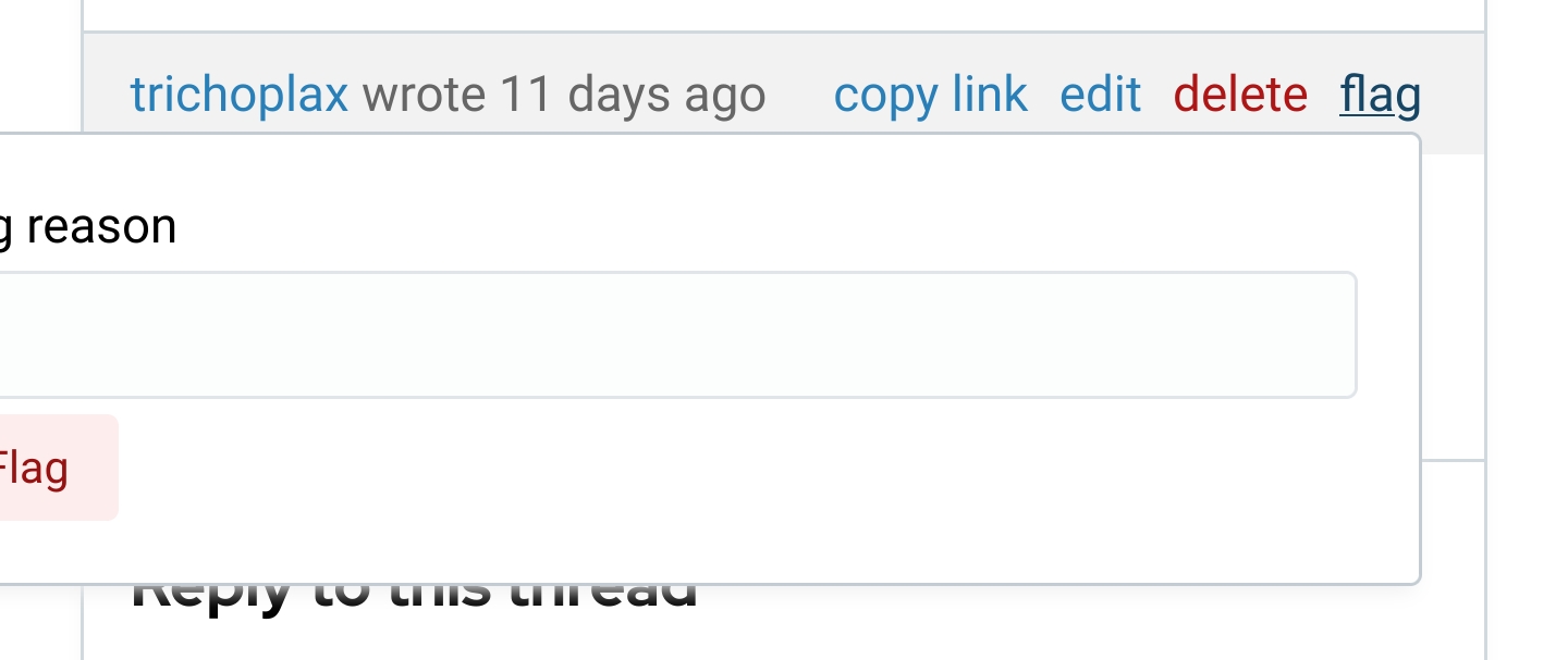
- From a comment thread page, pressing "flag" on a comment results in a pop up panel with a text input and a "Flag" button. On mobile, in portrait mode, this pop up panel overlaps the left hand edge of the screen so that the flag message being typed and the "Flag" button are obscured:
- 
- On mobile in landscape mode the pop up panel is visible in full:
- 
- However, in landscape mode the on screen keyboard takes up most of the screen and leaves very little context while composing a flag message, so some users may prefer portrait mode. Also, not every user will realise that the problem can be worked around by switching to landscape mode.
- ---
- A related but smaller problem: The pop up panel appears in front of the comment being flagged, so the context of the flagged comment is obscured while composing the flag message.
- From a comment thread page, pressing "flag" on a comment results in a pop up panel with a text input and a "Flag" button. On mobile, in portrait mode, this pop up panel overlaps the left hand edge of the screen so that the flag message being typed and the "Flag" button are obscured:
- 
- ## Workaround
- On mobile in landscape mode the pop up panel is visible in full:
- 
- However, in landscape mode the on screen keyboard takes up most of the screen and leaves very little context while composing a flag message, so some users may prefer portrait mode. Also, not every user will realise that the problem can be worked around by switching to landscape mode.
- ---
- A related but smaller problem: The pop up panel appears in front of the comment being flagged, so the context of the flagged comment is obscured while composing the flag message.
#1: Initial revision
Comment flagging broken on mobile portrait mode
From a comment thread page, pressing "flag" on a comment results in a pop up panel with a text input and a "Flag" button. On mobile, in portrait mode, this pop up panel overlaps the left hand edge of the screen so that the flag message being typed and the "Flag" button are obscured:  On mobile in landscape mode the pop up panel is visible in full:  However, in landscape mode the on screen keyboard takes up most of the screen and leaves very little context while composing a flag message, so some users may prefer portrait mode. Also, not every user will realise that the problem can be worked around by switching to landscape mode. --- A related but smaller problem: The pop up panel appears in front of the comment being flagged, so the context of the flagged comment is obscured while composing the flag message.


