Welcome to Codidact Meta!
Codidact Meta is the meta-discussion site for the Codidact community network and the Codidact software. Whether you have bug reports or feature requests, support questions or rule discussions that touch the whole network – this is the site for you.
Post History
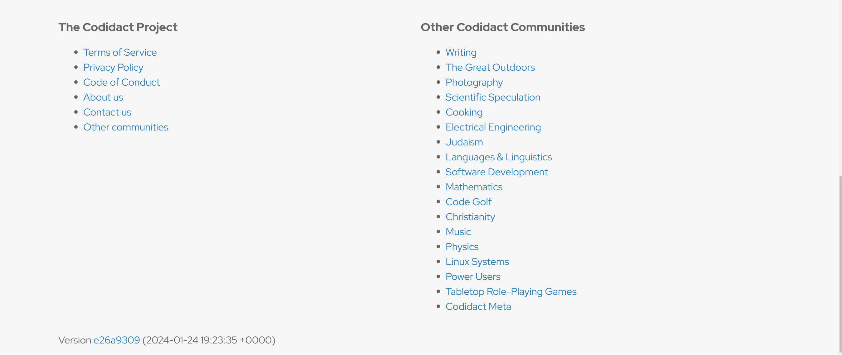
Context The footer of all pages on the Codidact network looks something like this: Pros Looks neat Cons As more and more communities emerge and the network grows, this list of "Other C...
#2: Post edited
Should we change the footer layout?
- Context
- =
- The footer of all pages on the Codidact network looks something like this:
- 
- Pros
- -
- - Looks neat
- Cons
- -
- - As more and more communities emerge and the network grows, this list of "Other Codidact Communities" will extend to bottom even more and there may be a point in the future where the footer is big enough to cover the whole screen.
- <br>
- Proposal
- =
- We could change it to become something like this (This is just a design made using a simple program and not official):
- 
- Pros
- -
- - Makes things look more organized.
- - Makes use of the empty horizontal space.
- - Makes the footer more compact.
- Cons
- -
- This list too may need to be expanded if the number of communities grows in the future but I **still** think it would be neater.
<br>Ultimately,=What does the community think?
- Context
- =
- The footer of all pages on the Codidact network looks something like this:
- 
- Pros
- -
- - Looks neat
- Cons
- -
- - As more and more communities emerge and the network grows, this list of "Other Codidact Communities" will extend to bottom even more and there may be a point in the future where the footer is big enough to cover the whole screen.
- <br>
- Proposal
- =
- We could change it to become something like this (This is just a design made using a simple program and not official):
- 
- Pros
- -
- - Makes things look more organized.
- - Makes use of the empty horizontal space.
- - Makes the footer more compact.
- Cons
- -
- This list too may need to be expanded if the number of communities grows in the future but I **still** think it would be neater.
#1: Initial revision
Should we change the footer layout?
Context = The footer of all pages on the Codidact network looks something like this:  Pros - - Looks neat Cons - - As more and more communities emerge and the network grows, this list of "Other Codidact Communities" will extend to bottom even more and there may be a point in the future where the footer is big enough to cover the whole screen. <br> Proposal = We could change it to become something like this (This is just a design made using a simple program and not official):  Pros - - Makes things look more organized. - Makes use of the empty horizontal space. - Makes the footer more compact. Cons - This list too may need to be expanded if the number of communities grows in the future but I **still** think it would be neater. <br> Ultimately, = What does the community think?


