Welcome to Codidact Meta!
Codidact Meta is the meta-discussion site for the Codidact community network and the Codidact software. Whether you have bug reports or feature requests, support questions or rule discussions that touch the whole network – this is the site for you.
Post History
What is it? Ordering communities by pairing them into groups of 3 based on quantity of categories. The communities which could not be paired with similar communities due to varying quantity of c...
#3: Post edited
Should we change the dashboard layout?
- What is it?
- -
- Ordering communities by pairing them into groups of 3 based on quantity of categories.
- The communities which could not be paired with similar communities due to varying quantity of categories can sit at the bottom.
- 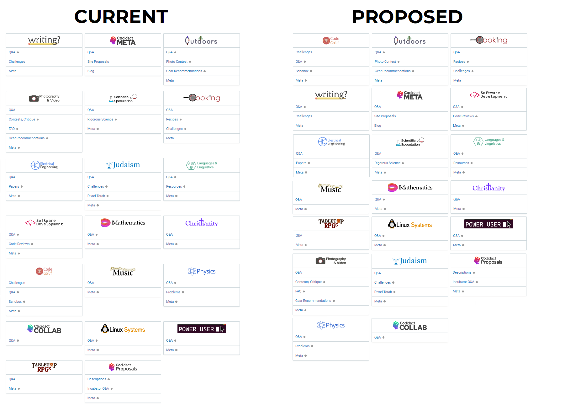
- *The right part of the above image is not official, it is just for demonstration purposes and made using a simple design program.
- Pros
- -
- - Makes it look more organized.
- - Makes use of unused vertical space, thus shortening the height.
- Cons
- -
- - Makes it hard for ranking communities to the top if they are more active, if this was how they were sorted before. If they are ordered based on which community was created first, then this downside does not hold much weight.
- There isn't really a major issue with the current layout and they are functional as-is. Therefore, not the _best_ use of developer time.What do you think?
- What is it?
- -
- Ordering communities by pairing them into groups of 3 based on quantity of categories.
- The communities which could not be paired with similar communities due to varying quantity of categories can sit at the bottom.
- 
- *The right part of the above image is not official, it is just for demonstration purposes and made using a simple design program.
- Pros
- -
- - Makes it look more organized.
- - Makes use of unused vertical space, thus shortening the height.
- Cons
- -
- - Makes it hard for ranking communities to the top if they are more active, if this was how they were sorted before. If they are ordered based on which community was created first, then this downside does not hold much weight.
- - There isn't really a major issue with the current layout and they are functional as-is. Therefore, not the _best_ use of developer time.
#2: Post edited
- What is it?
- -
- Ordering communities by pairing them into groups of 3 based on quantity of categories.
- 
- *The right part of the above image is not official, it is just for demonstration purposes and made using a simple design program.
- Pros
- -
- - Makes it look more organized.
- The communities which could not be paired with similar communities due to varying quantity of categories can sit at the bottom.- - Makes use of unused vertical space, thus shortening the height.
- Cons
- -
- - Makes it hard for ranking communities to the top if they are more active, if this was how they were sorted before. If they are ordered based on which community was created first, then this downside does not hold much weight.
- - There isn't really a major issue with the current layout and they are functional as-is. Therefore, not the _best_ use of developer time.
- What do you think?
- What is it?
- -
- Ordering communities by pairing them into groups of 3 based on quantity of categories.
- The communities which could not be paired with similar communities due to varying quantity of categories can sit at the bottom.
- 
- *The right part of the above image is not official, it is just for demonstration purposes and made using a simple design program.
- Pros
- -
- - Makes it look more organized.
- - Makes use of unused vertical space, thus shortening the height.
- Cons
- -
- - Makes it hard for ranking communities to the top if they are more active, if this was how they were sorted before. If they are ordered based on which community was created first, then this downside does not hold much weight.
- - There isn't really a major issue with the current layout and they are functional as-is. Therefore, not the _best_ use of developer time.
- What do you think?
#1: Initial revision
Should we change the dashboard layout?
What is it? - Ordering communities by pairing them into groups of 3 based on quantity of categories.  *The right part of the above image is not official, it is just for demonstration purposes and made using a simple design program. Pros - - Makes it look more organized. - The communities which could not be paired with similar communities due to varying quantity of categories can sit at the bottom. - Makes use of unused vertical space, thus shortening the height. Cons - - Makes it hard for ranking communities to the top if they are more active, if this was how they were sorted before. If they are ordered based on which community was created first, then this downside does not hold much weight. - There isn't really a major issue with the current layout and they are functional as-is. Therefore, not the _best_ use of developer time. What do you think?


