Welcome to Codidact Meta!
Codidact Meta is the meta-discussion site for the Codidact community network and the Codidact software. Whether you have bug reports or feature requests, support questions or rule discussions that touch the whole network – this is the site for you.
Comments on Confusing reuse of styling between button and tab header
Post
Confusing reuse of styling between button and tab header
At the top of the page there are sections for the community's Categories, which are displayed as tabs that can be switched between. For example, here on Meta Codidact there are "Q&A", "Site Proposals", and "Blog".
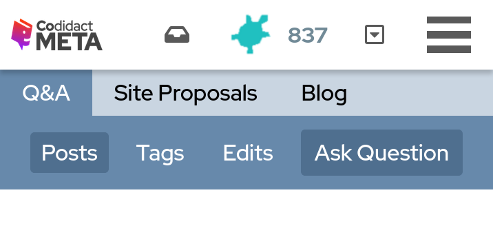
Similarly, on the next line down there are sections for things relevant to the currently selected Category. For example, here in Q&A there are "Posts", "Tags", and "Edits". However, instead of being displayed as tabs these show as buttons. This is inconsistent with the line above, and also somewhat confusing because there is also the "Ask Question" button on the same line. In the following image I have narrowed the window to emphasise the similarity between the "Posts" and "Ask Question" buttons:
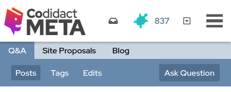
The same styling is being used to mean two different things.
- "Posts" has styling which distinguishes it from "Tags" and "Edits", so it is clear that we are on the "Posts" tab
- "Ask Question" has that same styling even though we are not on the "Ask Question" page
The problem is most pronounced on a narrow mobile screen where there is not even a gap between the tab titles and the "Ask Question" button:
Would it be clearer if "Posts", "Tags", and "Edits" were styled in the same way as the line above ("Q&A", "Site Proposals", and "Blog") so that "Ask Question" is clearly a button rather than a tab, and clearly available rather than already selected?
Alternatively, "Ask Question" could be seen as another tab, just like "Posts", "Tags", and "Edits". It could then be styled the same as "Tags" and "Edits" (the inactive tabs) rather than the same as "Posts" (the active tab). It could also possibly be moved left to be part of the "Posts", "Tags", and "Edits" family.
Do people see a potential improvement to be made here? If so, would you prefer to see one of the solutions suggested or something different?

1 comment thread