Welcome to Codidact Meta!
Codidact Meta is the meta-discussion site for the Codidact community network and the Codidact software. Whether you have bug reports or feature requests, support questions or rule discussions that touch the whole network – this is the site for you.
Logo becomes tiny in mobile landscape mode and narrow desktop windows
Related bug (not sure if the solution will be related):
The size of the community logo at the top left of the page changes based on the width of the window.
On mobile, with a narrow screen, this gives a large logo that is easily visible on the small mobile screen.
On desktop with a full screen browser, this gives a smaller logo that works better on the generally larger screen.
However, between these two widths, there is a range of values for which the logo becomes very small. On desktop, this can be seen by making the browser window narrower, but not sufficiently narrow to trigger the large mobile version of the logo. On mobile, this can be seen by rotating the screen to landscape instead of portrait. This tiny logo seems unsuitable either for a small window taking up part of the screen on a desktop, or for a landscape mobile screen.
Would it work better to keep the desktop size logo for all widths down to the point at which it switches to the mobile size logo? Also, would it be better to have the transition to the mobile size logo at a larger width, so that landscape mobile devices also use it? Or should landscape mobile devices use the desktop size logo? If the mobile size logo is intended to be used in both portrait and landscape mobile modes, would it be worth detecting whether the device is in portrait or landscape mode using orientation in CSS, then having a different width threshold for portrait than for landscape?
Here are the current transition points:
Width 511 pixels (mobile size logo)
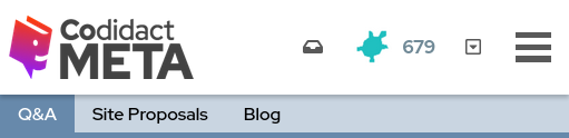
Width 512 pixels (tiny logo)

Width 780 pixels (tiny logo)

Width 781 pixels (desktop size logo)

0 answers

1 comment thread