Welcome to Codidact Meta!
Codidact Meta is the meta-discussion site for the Codidact community network and the Codidact software. Whether you have bug reports or feature requests, support questions or rule discussions that touch the whole network – this is the site for you.
Post History
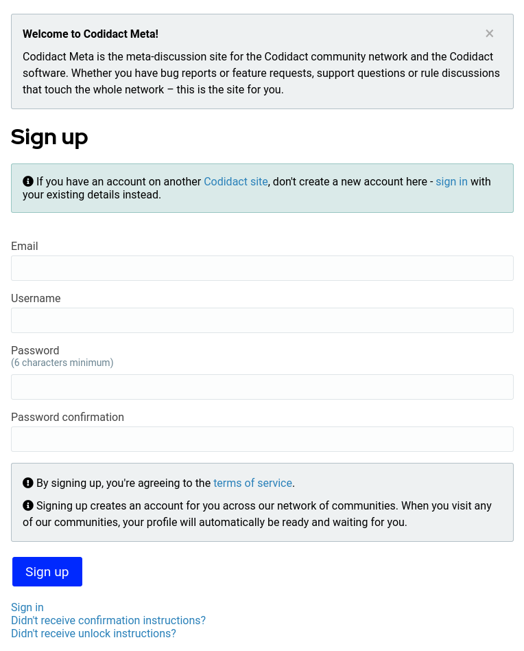
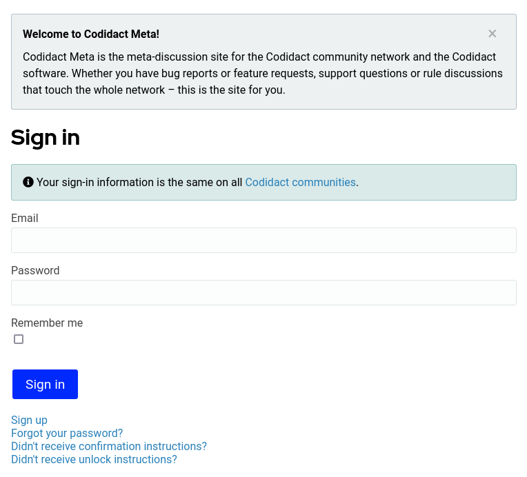
Here are screenshots of what the two pages currently look like on desktop: Sign up Sign in For Sign up, there is a green box suggesting using your existing details from another Codidact site...
#1: Initial revision
Here are screenshots of what the two pages currently look like on desktop: # Sign up  # Sign in  For Sign up, there is a green box suggesting using your existing details from another Codidact site. From the question wording I'm not sure whether this was already present when you first posted. Is that sufficient, or would you want your suggested wording to be in addition to this, or possibly incorporated into it? For Sign in, the only reference to signing up is still the small blue text link at the very bottom. On other sites I have ended up in the wrong section in the past so I would definitely like to see this made very clear. Does anyone else have any memories of past confusion or thoughts on how to make it easy to spot when you are on the wrong page?


