Welcome to Codidact Meta!
Codidact Meta is the meta-discussion site for the Codidact community network and the Codidact software. Whether you have bug reports or feature requests, support questions or rule discussions that touch the whole network – this is the site for you.
Sign In vs. Sign Up
Sign In and Sign Up are two different functions, with different buttons & pages, and they should remain separate.
However, there should be consistency in how they reference each other, as well as improved visibility. Specifically:
-
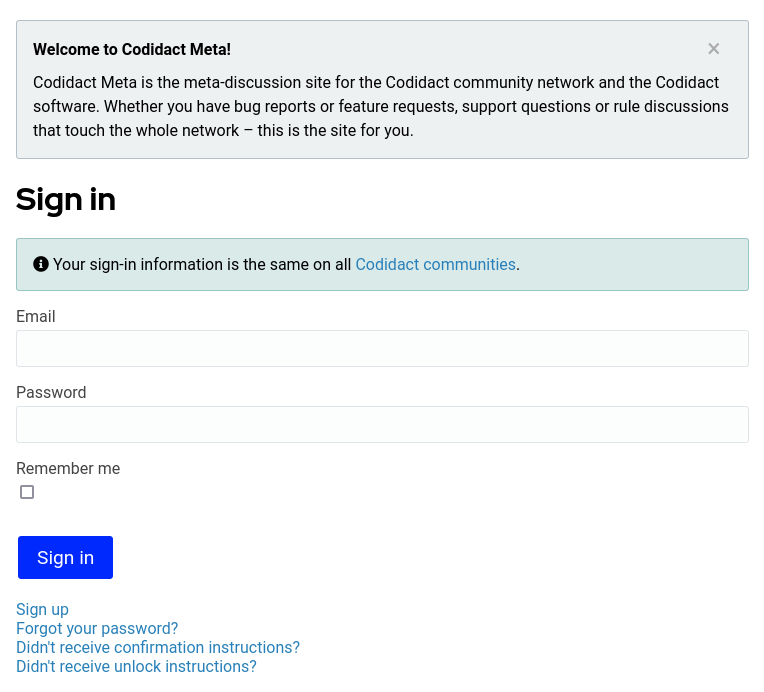
Sign In has small text links at the bottom for Sign In and Sign Up. The Sign In link is redundant since the user is already on that page, and should be removed. The Sign Up link is OK but there should also be a prominent Sign Up button. I know there is a button visible in the header, but that may not be so obvious to a newbie. I suggest something in the top, together with "Your sign-in information is the same on all Codidact sites", like:
New user? Click [Sign Up] to join Codidact. It is free and easy and lets you vote, ask and answer questions and participate in many other ways.
Actual text to be an instance/community-specific string.
-
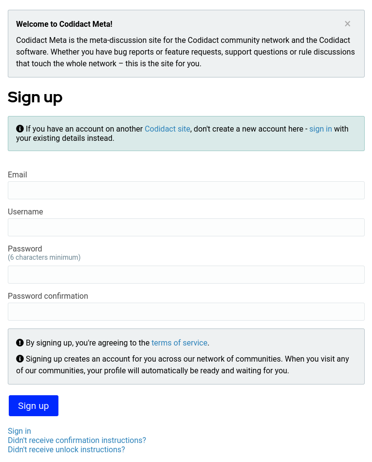
Sign Up has a small text link at the bottom for Sign In. While an already registered user at least has some experience with the site, based on the numerous newbie-double-accounts in Some Other sites, I suggest adding something like:
Already registered? Click [Sign In] to sign in with your existing details. Please don't register multiple accounts unnecessarily - it makes it harder for you to keep track of your posts and gain privileges on the site and it makes it harder for the moderation team to manage the site. If you forgot your password, click [Forgot your password?].
Actual text to be an instance/community-specific string. This replaces the existing text.
Key to both is that the links/buttons should be really obvious. Either inline buttons or somehow big/bold/underline/boxed/fontawesome icon/etc. A blue (not even underlined) link in the same size just doesn't stand out. For the geeks among us, none of this is a big deal. For the non-geeks, it gets confusing/hard to use.
1 answer
Here are screenshots of what the two pages currently look like on desktop:
Sign up
Sign in
For Sign up, there is a green box suggesting using your existing details from another Codidact site. From the question wording I'm not sure whether this was already present when you first posted. Is that sufficient, or would you want your suggested wording to be in addition to this, or possibly incorporated into it?
For Sign in, the only reference to signing up is still the small blue text link at the very bottom. On other sites I have ended up in the wrong section in the past so I would definitely like to see this made very clear. Does anyone else have any memories of past confusion or thoughts on how to make it easy to spot when you are on the wrong page?
0 comment threads

1 comment thread