Communities

Writing
Writing
Codidact Meta
Codidact Meta
The Great Outdoors
The Great Outdoors
Photography & Video
Photography & Video
Scientific Speculation
Cooking
Cooking
Electrical Engineering
Judaism
Judaism
Languages & Linguistics
Software Development
Mathematics
Mathematics
Christianity
Christianity
Code Golf
Code Golf
Music
Music
Physics
Physics
Linux Systems
Linux Systems
Power Users
Power Users
Tabletop RPGs
Tabletop RPGs
Community Proposals
Community Proposals
tag:snake search within a tag
answers:0 unanswered questions
user:xxxx search by author id
score:0.5 posts with 0.5+ score
"snake oil" exact phrase
votes:4 posts with 4+ votes
created:<1w created < 1 week ago
post_type:xxxx type of post
Search help
Notifications
Mark all as read See all your notifications »
Q&A

Welcome to Codidact Meta!

Codidact Meta is the meta-discussion site for the Codidact community network and the Codidact software. Whether you have bug reports or feature requests, support questions or rule discussions that touch the whole network – this is the site for you.

Comments on Images are stretched, not scaled, on narrow browsers

Parent

Images are stretched, not scaled, on narrow browsers

+4
−0

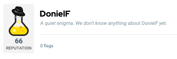
This is what my profile page, as of current writing, looks like on a normal width browser:

Normal-height profile

This is what it looks like once the browser window is sufficiently narrow:

Stretched out profile

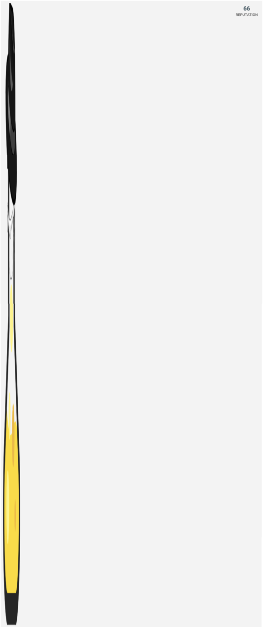
I'd have thought that the image should be scaled, rather than oddly stretched.


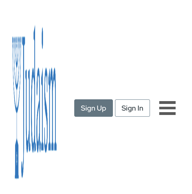
While the above holds on both mobile portrait and desktop for narrow windows, the website logo at the top of the window scales properly on desktop and is squished on mobile portrait:

Squished Judaism logo

History
Why does this post require moderator attention?
You might want to add some details to your flag.
Why should this post be closed?

0 comment threads

Post
+1
−0

We support browser widths down to 360px, which is the smallest common browser width on most modern mobile devices. At that width, I see this:

Image alt text

Even going smaller than that, I can't reproduce what you're seeing here - what's your environment (device, browser, dimensions etc)?

History
Why does this post require moderator attention?
You might want to add some details to your flag.

1 comment thread

General comments (3 comments)
General comments
luap42‭ wrote almost 4 years ago

I can reproduce the issue on mobile iOS Chrome and Safari.

DonielF‭ wrote almost 4 years ago

Apple claims that my phone has dimensions of 1334x750 pixels. This issue happens for me on my iOS Safari browser, but only in portrait orientation. In Safari (13.0.5) on my Mac, where the pictures in my original post were taken, the images get messed up starting at as wide as ~1,020 pixels, the point at which the window transitions from placing my reputation below my icon to placing it to the side.

dmckee‭ wrote almost 4 years ago

Seeing it on iOS/chrome as well. Though it’s fairly modest in my case.