Welcome to Codidact Meta!
Codidact Meta is the meta-discussion site for the Codidact community network and the Codidact software. Whether you have bug reports or feature requests, support questions or rule discussions that touch the whole network – this is the site for you.
Images are stretched, not scaled, on narrow browsers
This is what my profile page, as of current writing, looks like on a normal width browser:

This is what it looks like once the browser window is sufficiently narrow:
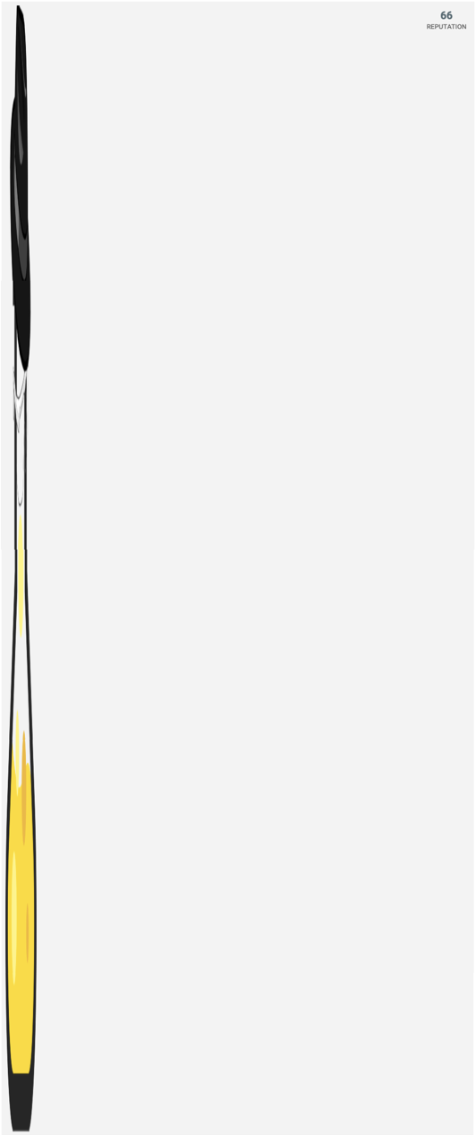
I'd have thought that the image should be scaled, rather than oddly stretched.
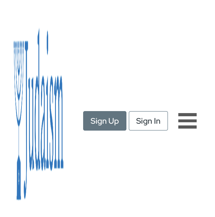
While the above holds on both mobile portrait and desktop for narrow windows, the website logo at the top of the window scales properly on desktop and is squished on mobile portrait:
2 answers
Oh yeah right, that bug, since Art just put a status-completed tag on it, I could also take my time and reply with what the issue is, because it's quite interesting (and this is also a good mental note for next time a similiar issue appears).
It turns out, that mobile iOS browsers don't like images being inside of flexbox containers. Most other browsers default the align-self property for such images to flex-start (or something similiar). This means, that the image will be positioned without at the top of the flex container (or at the reading direction start if it is vertical - for English this is the left side).
However, for some reasons, Safari defaults to stretch, which, as the name says, causes the image to be stretched to take all the available space. I have no idea, why they are doing it that way. It doesn't seem to be the best solution IMHO for the reason, that it causes the bug we have seen here.
Anyway, the fix is simple, just add an align-self: flex-start to the image and gone is the bug. (We can just add this to the general <img> selector, because it shouldn't have any other side effects.1)
-
This will likely result in an extremely awkward bug, that will cause extreme trouble in a few years. Don't say you weren't warned, future luap42! ↩
0 comment threads
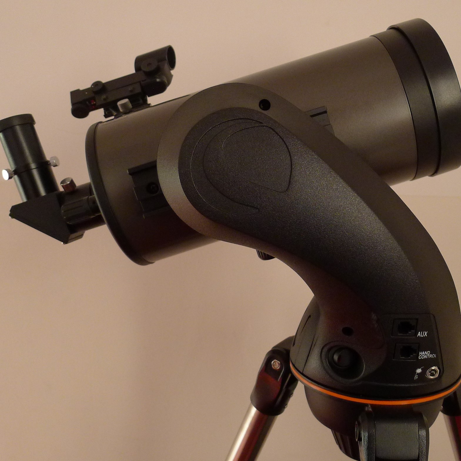
We support browser widths down to 360px, which is the smallest common browser width on most modern mobile devices. At that width, I see this:
Even going smaller than that, I can't reproduce what you're seeing here - what's your environment (device, browser, dimensions etc)?

0 comment threads