Communities

Writing
Writing
Codidact Meta
Codidact Meta
The Great Outdoors
The Great Outdoors
Photography & Video
Photography & Video
Scientific Speculation
Cooking
Cooking
Electrical Engineering
Judaism
Judaism
Languages & Linguistics
Software Development
Mathematics
Mathematics
Christianity
Christianity
Code Golf
Code Golf
Music
Music
Physics
Physics
Linux Systems
Linux Systems
Power Users
Power Users
Tabletop RPGs
Tabletop RPGs
Community Proposals
Community Proposals
tag:snake search within a tag
answers:0 unanswered questions
user:xxxx search by author id
score:0.5 posts with 0.5+ score
"snake oil" exact phrase
votes:4 posts with 4+ votes
created:<1w created < 1 week ago
post_type:xxxx type of post
Search help
Notifications
Mark all as read See all your notifications »
Q&A

Welcome to Codidact Meta!

Codidact Meta is the meta-discussion site for the Codidact community network and the Codidact software. Whether you have bug reports or feature requests, support questions or rule discussions that touch the whole network – this is the site for you.

Comments on Should the active category name not be shown twice on the categories header?

Parent

Should the active category name not be shown twice on the categories header?

+2
−1

One thing one realizes quickly when for example visiting meta.codidact.com is that it's a site about Q&A. The reason is that for example it is written twice:

Screenshot of the current design showing the category name twice

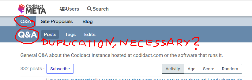
But is this duplication really necessary? What is the purpose of it? Usually duplications are avoided.

It's the category name that is printed on the left below the tabs again. But the active tab is already visible by the different background and one could make it even more visible.

I tried to remove the duplication (see below, current state on the left) and already without the repetition it looks better, I'd say. Also the "Posts, Tags, Edits" would then start always at the same position on screen.

Mock up of how it would look like without the duplication

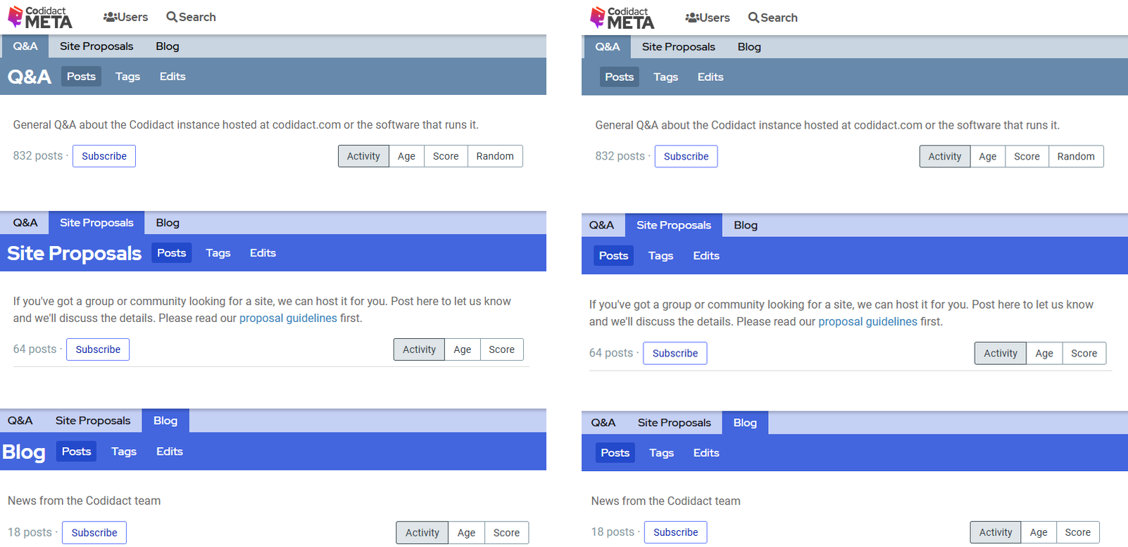
If needed, one could also increase the font size of the category names in the tabs or make the active category also with a higher font weight while at the same time decreasing the height of the "Posts, ..." row a bit. This change would not be much effort.

What do you think?

History
Why does this post require moderator attention?
You might want to add some details to your flag.
Why should this post be closed?

0 comment threads

Post
+0
−0
Should the active category name not be shown twice on the categories header?

Eh, maybe, but it also doesn't seem like a problem to solve.

One advantage of showing the selected category on the bottom line is that it can be bigger and bolder. It's easier to see at a quick glance what category you're in.

On the scale of 0-10 importance, this is barely 1, if that.

History
Why does this post require moderator attention?
You might want to add some details to your flag.

1 comment thread

Basically means you don't care either way? (2 comments)
Basically means you don't care either way?
Trilarion‭ wrote over 2 years ago · edited over 2 years ago

Just to fully understand the answer, if I made a pull request about it on Github, this answer means it doesn't care either way, right?

Importance isn't that important for me in this case, because the time needed to change that is also very small. There might be more important things but they also take much longer to realize. 10 times a 1 maybe also makes a 10. :)

Olin Lathrop‭ wrote over 2 years ago

I don't really care about this "problem". To some extent, I actually like how it is. But, if it were to change I would forget about it soon enough, and certainly not try to get it changed back.