Welcome to Codidact Meta!
Codidact Meta is the meta-discussion site for the Codidact community network and the Codidact software. Whether you have bug reports or feature requests, support questions or rule discussions that touch the whole network – this is the site for you.
Comments on Should we start displaying the score of a post instead of the raw votes?
Parent
Should we start displaying the score of a post instead of the raw votes?
Currently, when viewing a post, Codidact will show you the raw votes on a post, with the breakdown into upvotes and downvotes:
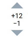
There's been some feedback that this is a bit too much to show, especially coming from platforms like Stack Exchange where they generally just show the aggregate score of upvotes and downvotes as one number (with the option to expand the votes to see the split). We decided to show both counts automatically to better show when there's controversy.
However, we now also have another option. We have a method for scoring posts that assigns a score between 0 and 1 to each post.
Perhaps instead of showing the raw votes on each post, we should instead show the post score (e.g. 0.81363... or 0.3793...), rounded to the nearest two or three decimal places (so that it would show as 0.937 or 0.276), with the raw votes available on request, perhaps either on click or in the tools menu.
This would take people a bit of time to get used to, but it might be worth that initial adjustment time, since this... is our scoring system and we want people to be familiar with it quickly.
This has the added benefit of making it much clearer why answers are sorted the way they are by displaying their score (that's currently computed without being displayed) for everyone to see. The raw votes matter less than the computed score.
Background: the information content being presented In principle, the number of upvotes and number of downvotes on a …
1y ago
Why show scores at all? When I was at Stack Exchange, we spent a good deal of time discussing sort orders in the cont …
1y ago
If we show raw Wilson score I think we're going to see a lot of confusion and questions -- "is 0.65 good?" "what does it …
5y ago
I agree that on a list of questions, one clear indicator of fitness is most helpful. On a post's own page, it might make …
5y ago
All the proposals so far are missing what people really want to know, which are two orthogonal metrics: How good/bad …
5y ago
instead of - Absolutely not! Showing separate + and - votes is a good thing. Or as they say, that's not a bug, it's a …
5y ago
Just a thought that occurred to me: One problem when seeing the Wilson score when not knowing it is that it's not cle …
12mo ago
In my view displaying fractional numbers representing an unintuitive measure would be even worse than displaying two int …
2y ago
Post
Background: the information content being presented
In principle, the number of upvotes and number of downvotes on a post are two orthogonal pieces of information, that collectively tell you the community's overall opinion of the content (or at least, of those who voted).
Traditional systems (like on Stack Exchange, which itself is informed by... a lot of older sites; hardly anyone could think of anything else in those days) tend to just count upvotes as +1 and downvotes as -1 and give a sum. That fundamentally projects two-dimensional information onto one dimension, and thus loses information. In particular, content that has been totally ignored, looks much the same as content that is highly controversial (significant upvotes and downvotes in roughly equal number). Stack Exchange lets some users see separate upvote and downvote tallies, but this is a privilege extended to a minority of users based on reputation. That sort of restriction is clearly contrary to Codidact principles. Meanwhile, their sorting is still based on the +1/-1 sum - which we have already decided is inferior. They recently implemented a system that can time-weight the votes on older questions, but it still fundamentally treats upvotes and downvotes symmetrically.
On the other hand, Codidact's existing presentation does two interesting things: it shows separate vote tallies to everyone, and it computes a Wilson score - that has the net effect of a) diminishing returns for high raw vote scores and b) bias towards a neutral computed score (whichever votes are in the minority, count more). This Wilson score is based on sound theory and has shown itself to give good results thus far.
The existing presentation
Whereas the simple subtraction of downvotes from upvotes collapses the voting information onto one dimension, I think of Codidact's idea as analogous to a rectangular-to-polar conversion. It takes two simple quantities that can vary independently (number of upvotes and number of downvotes), and produces two different metrics that are more useful in context (democratically-judged quality and overall measured interest).
However, the way this information is presented right now does not make that transformation clear or obvious. We don't see the actual scores in the UI directly, only on hover; and the raw numbers are hard to interpret anyway. They inform the sort order, but that makes it hard to appreciate how the numbers that are directly shown actually relate to the sort order. This sometimes leads people to wonder why it doesn't just show a single number up front - but of course, adding the displayed positive number and negative number together would give a misleading result.
Meanwhile, we're left to infer the "overall measured interest" by looking at the numbers and going "oh, there are a couple of big numbers here". But there are at least two problems with that. First, it's an extra inferential step. Second, the reader is tempted to do the old-school calculation of subtracting the downvotes; but the real reason for showing these numbers is to assess total interest. People who downvoted a post, registered an opinion on it in exactly the same way that people who upvoted it did - they just have the opposite opinion. As such, the proper number to consider here is the sum of upvotes and downvotes - i.e., the total number of votes. It is not a problem to count upvotes and downvotes the same way, because the purpose of this information is to assess interest, not quality; quality was already covered by the Wilson score.
Design proposal
Thus, fundamentally, two pieces of information should be shown: the quality metric (which also informs page sort order by default) and the interest metric. The former is a Wilson score value - a real (well, floating-point) number ranging from 0 to 1, which is hard to understand as a raw number - but could easily be explained graphically by partially filling a region with solid colour. The latter is a raw number, the total number of votes on the question.
I propose to display the Wilson score as a transparent-background circle that is partially filled with a wedge corresponding to the score. The colour of the wedge would range from red to green as an aesthetic enhancement, but the size of the wedge is informative and could be easily interpreted by colour-blind users. Then, display a total number of votes, underneath the circle (so as not to interfere with the visual perception of the wedge), and explicitly label it as a vote tally.
For example, with the default settings, a post at 4 upvotes and 2 downvotes would have a Wilson score of 0.6. I'd like to see it displayed something like so:

I chose the colour for this example in GIMP in LCh mode: Lightness 55 (out of 100), Chroma 55 (out of 200), hue 102 degrees. My idea was that the LC values should be constant, and hue should vary from 30 to 150 degrees; I chose LC values that would avoid the corresponding RGB values going out of range. I shaped the wedge freehand, so it might not be accurate in my mockup. I envision the actual system doing a proper calculation. These wedge images could be prepared client-side with JavaScript drawing on a <canvas> element; however, it might be better to have static cached images representing scores, say, in increments of 0.01, and show whichever is closest to the actual score.
It might be desirable to include an outline of the full circle in addition to the wedge shape. I deliberately aligned the wedge to start at the bottom and grow clockwise; the intended design metaphor is an analog meter such as a speedometer, oven thermometer, VU meter etc. (Different shapes might work better, and I mention my own design inspiration in case it motivates an actual graphic artist.)
The "votes" text might be unnecessary, but I personally like the idea of emphasizing that the single number shown is a total vote tally. There might be better ways to do this, such as putting small "votes" text on a second line underneath the number. Another possibility (either instead of or in addition to a raw vote count) would be to shade the background behind the circle according to the popularity: white for posts that haven't received votes, towards black for posts that received a lot of votes (or the opposite of that, for a hypothetical future dark mode). But coming up with a good formula for that shade might be difficult.
4 comment threads

1 comment thread