Welcome to Codidact Meta!
Codidact Meta is the meta-discussion site for the Codidact community network and the Codidact software. Whether you have bug reports or feature requests, support questions or rule discussions that touch the whole network – this is the site for you.
Should we start displaying the score of a post instead of the raw votes?
Currently, when viewing a post, Codidact will show you the raw votes on a post, with the breakdown into upvotes and downvotes:
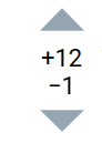
There's been some feedback that this is a bit too much to show, especially coming from platforms like Stack Exchange where they generally just show the aggregate score of upvotes and downvotes as one number (with the option to expand the votes to see the split). We decided to show both counts automatically to better show when there's controversy.
However, we now also have another option. We have a method for scoring posts that assigns a score between 0 and 1 to each post.
Perhaps instead of showing the raw votes on each post, we should instead show the post score (e.g. 0.81363... or 0.3793...), rounded to the nearest two or three decimal places (so that it would show as 0.937 or 0.276), with the raw votes available on request, perhaps either on click or in the tools menu.
This would take people a bit of time to get used to, but it might be worth that initial adjustment time, since this... is our scoring system and we want people to be familiar with it quickly.
This has the added benefit of making it much clearer why answers are sorted the way they are by displaying their score (that's currently computed without being displayed) for everyone to see. The raw votes matter less than the computed score.
Background: the information content being presented In principle, the number of upvotes and number of downvotes on a …
1y ago
Why show scores at all? When I was at Stack Exchange, we spent a good deal of time discussing sort orders in the cont …
1y ago
If we show raw Wilson score I think we're going to see a lot of confusion and questions -- "is 0.65 good?" "what does it …
5y ago
I agree that on a list of questions, one clear indicator of fitness is most helpful. On a post's own page, it might make …
5y ago
All the proposals so far are missing what people really want to know, which are two orthogonal metrics: How good/bad …
5y ago
instead of - Absolutely not! Showing separate + and - votes is a good thing. Or as they say, that's not a bug, it's a …
5y ago
Just a thought that occurred to me: One problem when seeing the Wilson score when not knowing it is that it's not cle …
12mo ago
In my view displaying fractional numbers representing an unintuitive measure would be even worse than displaying two int …
2y ago
8 answers
Background: the information content being presented
In principle, the number of upvotes and number of downvotes on a post are two orthogonal pieces of information, that collectively tell you the community's overall opinion of the content (or at least, of those who voted).
Traditional systems (like on Stack Exchange, which itself is informed by... a lot of older sites; hardly anyone could think of anything else in those days) tend to just count upvotes as +1 and downvotes as -1 and give a sum. That fundamentally projects two-dimensional information onto one dimension, and thus loses information. In particular, content that has been totally ignored, looks much the same as content that is highly controversial (significant upvotes and downvotes in roughly equal number). Stack Exchange lets some users see separate upvote and downvote tallies, but this is a privilege extended to a minority of users based on reputation. That sort of restriction is clearly contrary to Codidact principles. Meanwhile, their sorting is still based on the +1/-1 sum - which we have already decided is inferior. They recently implemented a system that can time-weight the votes on older questions, but it still fundamentally treats upvotes and downvotes symmetrically.
On the other hand, Codidact's existing presentation does two interesting things: it shows separate vote tallies to everyone, and it computes a Wilson score - that has the net effect of a) diminishing returns for high raw vote scores and b) bias towards a neutral computed score (whichever votes are in the minority, count more). This Wilson score is based on sound theory and has shown itself to give good results thus far.
The existing presentation
Whereas the simple subtraction of downvotes from upvotes collapses the voting information onto one dimension, I think of Codidact's idea as analogous to a rectangular-to-polar conversion. It takes two simple quantities that can vary independently (number of upvotes and number of downvotes), and produces two different metrics that are more useful in context (democratically-judged quality and overall measured interest).
However, the way this information is presented right now does not make that transformation clear or obvious. We don't see the actual scores in the UI directly, only on hover; and the raw numbers are hard to interpret anyway. They inform the sort order, but that makes it hard to appreciate how the numbers that are directly shown actually relate to the sort order. This sometimes leads people to wonder why it doesn't just show a single number up front - but of course, adding the displayed positive number and negative number together would give a misleading result.
Meanwhile, we're left to infer the "overall measured interest" by looking at the numbers and going "oh, there are a couple of big numbers here". But there are at least two problems with that. First, it's an extra inferential step. Second, the reader is tempted to do the old-school calculation of subtracting the downvotes; but the real reason for showing these numbers is to assess total interest. People who downvoted a post, registered an opinion on it in exactly the same way that people who upvoted it did - they just have the opposite opinion. As such, the proper number to consider here is the sum of upvotes and downvotes - i.e., the total number of votes. It is not a problem to count upvotes and downvotes the same way, because the purpose of this information is to assess interest, not quality; quality was already covered by the Wilson score.
Design proposal
Thus, fundamentally, two pieces of information should be shown: the quality metric (which also informs page sort order by default) and the interest metric. The former is a Wilson score value - a real (well, floating-point) number ranging from 0 to 1, which is hard to understand as a raw number - but could easily be explained graphically by partially filling a region with solid colour. The latter is a raw number, the total number of votes on the question.
I propose to display the Wilson score as a transparent-background circle that is partially filled with a wedge corresponding to the score. The colour of the wedge would range from red to green as an aesthetic enhancement, but the size of the wedge is informative and could be easily interpreted by colour-blind users. Then, display a total number of votes, underneath the circle (so as not to interfere with the visual perception of the wedge), and explicitly label it as a vote tally.
For example, with the default settings, a post at 4 upvotes and 2 downvotes would have a Wilson score of 0.6. I'd like to see it displayed something like so:

I chose the colour for this example in GIMP in LCh mode: Lightness 55 (out of 100), Chroma 55 (out of 200), hue 102 degrees. My idea was that the LC values should be constant, and hue should vary from 30 to 150 degrees; I chose LC values that would avoid the corresponding RGB values going out of range. I shaped the wedge freehand, so it might not be accurate in my mockup. I envision the actual system doing a proper calculation. These wedge images could be prepared client-side with JavaScript drawing on a <canvas> element; however, it might be better to have static cached images representing scores, say, in increments of 0.01, and show whichever is closest to the actual score.
It might be desirable to include an outline of the full circle in addition to the wedge shape. I deliberately aligned the wedge to start at the bottom and grow clockwise; the intended design metaphor is an analog meter such as a speedometer, oven thermometer, VU meter etc. (Different shapes might work better, and I mention my own design inspiration in case it motivates an actual graphic artist.)
The "votes" text might be unnecessary, but I personally like the idea of emphasizing that the single number shown is a total vote tally. There might be better ways to do this, such as putting small "votes" text on a second line underneath the number. Another possibility (either instead of or in addition to a raw vote count) would be to shade the background behind the circle according to the popularity: white for posts that haven't received votes, towards black for posts that received a lot of votes (or the opposite of that, for a hypothetical future dark mode). But coming up with a good formula for that shade might be difficult.
4 comment threads
If we show raw Wilson score I think we're going to see a lot of confusion and questions -- "is 0.65 good?" "what does it take to get to 0.8?" etc. Even if we explain that it's a value from 0 to 1 indicating some quality measure, I don't think it's all that meaningful to show that number to most people -- and certainly not as the only indication.
We should consider context. I think it's very important to show the raw votes for answers to questions. The sorting conveys relative ranking, so we don't need to show meters or scores or anything else there -- just the votes. I'm not averse to making the scores available, but they shouldn't be primary because the page already conveys this information in a more intuitive way.
Why is it important to show the raw vote counts? Because ranking, and scores were we to show them, give a sense, but if you're considering which of these answers on EE to follow to modify your phone, you really ought to know that while that answer has lots of upvotes it also has lots of downvotes. That should prompt you to look more closely. Maybe the downvoters are wrong or misunderstood, or maybe they know one missed step and you'll brick your expensive phone.
For top-level posts (questions or articles), though, our priorities might be different. Is it actually valuable to see question scores on the question list at all -- either raw scores or a meter or both? What are we trying to accomplish by showing this? If we answer that, I think we'll be in a better position to decide what to show there.
Finally, on the question page I talked about answers but not the question. Since we're showing raw votes for all the answers, I think consistency demands that we show them for the question too. And just as we're not showing graphical meters for answers (because we don't need to), I wouldn't show one for the question on the question page.
A final thought about meters on the question page: when we were kicking ideas around on wireframes, someone suggested that the meter should take other factors into account, for example that a question is closed. If the function of the meter is to highlight questions that are likely to be most fruitful for a busy skimmer, then we should take such factors into account -- at which point the meter isn't just a reflection of score. If, on the other hand, the meter is just a reflection of score, then what are we trying to accomplish by showing it? (The answer might be multi-modal communication, but I'd rather ask and find out than guess.)
Why show scores at all?
When I was at Stack Exchange, we spent a good deal of time discussing sort orders in the context of obsolete answers. One suggestion was to change the sort order to use Wilson scoring. The objections were:
- The algorithm is confusing so will raise more questions than shed light.
- For many questions sorting by the sum of positive and negative votes gives the same result as using a more complicated sorting mechanism.
- Answer scores are part of the Stack Overflow brand.
The final point doesn't apply here except to the degree Codidact's strategy might be to distance/embrace a connection to Stack Overflow.
The goal of a number is to give people a quick view into how good the answer is. If nobody has voted, the answer is ¯\_(ツ)_/¯. The more people who have voted, the greater confidence we have in the voting. For instance, which toaster would you buy?


Even though we would normally pick a 5-star toaster over a 4½ star toaster, we know that 46 ratings probably means more than 1 rating. The single 5-star rating could very well have been from someone associated with the product.
There are some other things it would be helpful to know, such as how old the ratings are and if the product has changed after getting a handful of ratings. And this also applies to answers. An answer with many upvotes might not be good anymore if the world has changed and the answer hasn't. Or maybe someone edited the answer in a way that would have caused early voters to vote differently if the edit had been original.
We have some intuition when it comes to the 5 star review system Amazon uses. The simple sum of positive and negative votes is also easy to understand. Codidact's display isn't for most people. Looking at answers to this very question right at the moment, I see:
- 6/1
- 3/0
- 6/2
With some help from a calculator, I can see that's the right sorting:
- 0.4869
- 0.4385
- 0.4093
But it kinda breaks my brain to think about it. I just don't have the right intuition. (Yet?)
Show rank instead?
A simple change would be to display ranks instead of scores:
- This is the top ranked answer by Wilson score, so it's #1!
- Still a good answer.
- Not great, but better than #4.
- Just good enough to avoid getting deleted.
If you click on the rank, you could see details such as the number of up/down votes, the confidence interval and maybe some indication of age of votes. It really doesn't matter how you calculate rank as long as it's documented somewhere. That's helpful because it could let you explore using other signals.
As Evan Miller wrote in "Bayesian Average Ratings":
Bayesian average ratings are an excellent way to sort items with up-votes and down-votes, and lets us incorporate a desired level of caution directly into the model. It is eminently “hackable” in the sense of affording opportunities for adjusting the model to accommodate new features (prior beliefs, belief decay) without violating the model’s consistency. As long as we make a judicious choice of belief structure (namely a beta distribution), it is feasible to compute.
As with other hackable systems, it is possible to take the Bayesian framework and produce something utterly useless. But as long as you set aside time for a little experimentation, I think you’ll eventually arrive at a sorting method that helps people find the good stuff quickly.
Now you do lose something because there's still a vast difference between answers scored +10/-0 and a +0/-10, but with only two answers the second one will be ranked second. (By definition!) Sometimes second answers are great, but not in this case. So maybe some indication of the strength of the system's belief in the quality of the answer would be helpful. (I'm partial to Isaac Moses' signal strength indicator.) But the primary signal is simply where the answer is placed on the page and maybe a number showing that rank.
What about random, weighted placement?
If you remove the numbers (whether score or rank) that opens up another possibility: randomly place each answer on the page with better answers weighted more heavily to be on top. When there are several answers with no votes, this is an honest method of display since the system can't know which is the best. Chronological sorting is usually a default, but is the best answer the first or the last? On a programming site, the more recent answer might have incorporated updates to the tools. But the older answer might be standard and the newer answer a speculative variant. Only a human can tell.
Once votes start to roll in, the system can estimate which answer is better, but it's still an estimate. Bumping up based on upvotes and down based on downvotes gives a more accurate view, of course. But random placement gives downvoted answers a chance of getting support and avoids the fastest gun bias.
Random sorting has an impact on performance because of caching. You either need to rebuild the page every time it loads or be stuck with just one random sorting until something triggers a rebuild. Building this is probably not worthwhile unless there can be some experimentation showing that random order is useful.
How about bins?
Another option would be to group answers in "quality bins". Pick a Wilson score threshold to be "great answers" and put them in a section nearest the top of the page. Answers the system is less confident about would be in a lower group. Maybe you only need two groups:
- Good answers
- Other
Or maybe a bin for bad answers that aren't yet deleted. I'm less sure that's helpful though becasue:
Most readers want the top answer and maybe the second
Based on my experience, the key indicator of answer quality for visitors is the top answer. (I thought I did a study at Stack Exchange, but I can't find any evidence. Maybe it was internal?) This might be less true on more philosophical communities (like meta), but people don't have much patience for reading past one or maybe two answers. That means sort order is really important. I find the current +/- display distracting. I want a discoverable way to see the breakout, but my intuition about that the numbers mean (perhaps from years of seeing scores) isn't formed yet. Sort order probably tells me all I need anyway.
I agree that on a list of questions, one clear indicator of fitness is most helpful. On a post's own page, it might make more sense to also show the up- and down-vote counts.
Given that the "score," here, does not directly represent anything anyone can count, but rather is the result of plugging the up- and down-votes into a not-fully-intuitive continuous function, I think that showing the literal number that comes out of that function would be more confusing than helpful. Instead, I suggest representing it with a Likert scale, with a Help topic that provides both the formula and broad qualitative interpretations of the various scores. For example:
-
↓↓ (Wilson score 0 - 20%): The community has expressed a clear consensus that this is not a helpful post.
-
↓ (Wilson score 20% - 40%): There is some indication from the community that this is not a helpful post.
-
↕ (Wilson score 40% - 60%): The community hasn't expressed a clear consensus regarding how helpful this post is.
-
↑ (Wilson score 60% - 80%): There is some indication from the community that this is a helpful post.
-
↑↑ (Wilson score 80 - 100%): The community has expressed a clear consensus that this is a helpful post.
In place of the ASCII arrow glyphs in this example, some variation of a traditional five-level signal-strength symbol could be used, such as:

All the proposals so far are missing what people really want to know, which are two orthogonal metrics:
- How good/bad the crowd thinks the answer is.
- How heavily the crowd has weighed in.
The first tells you how much to believe the answer, and the second how much to believe the first point. Put another way, you want to see a score and how big the error band is for that score.
So lets show that.
The obvious formula for #1 is (up votes) / (total votes). I'd multiply that by 100 then round to the nearest integer. Values from 0-100 are easier to explain than 0.0 to 1.0. You don't really need to know the difference between 98.2 and 98.4, so keep it simple.
There are more choices how to present the confidence, but the total number of votes is a really simple value. We could get into probability, gaussian distribution assumptions, standard deviations, and the like, but too many people won't understand that and just tune out.
Examples
+5, -3: Score 63, votes 8
+20, -15: Score 57, votes 35
+0, -0: Votes 0
+0, -3: Score 0, votes 3
I would display the 0-100 score most prominently, probably without a label, then the number of votes below that in smaller font with a label.
instead of - Absolutely not!
Showing separate + and - votes is a good thing. Or as they say, that's not a bug, it's a feature.
If you want to show the score (whether integer net score or Wilson # or whatever) in addition to the + and - values, that's fine with me. But the + and - values are themselves very useful, and anyone who wants a simple net score can easily figure that out.
To answer the "redundant" part, how about always showing the non-zero parts. Examples:
- +2, -1 - show both (as now)
- +2, -0 - show: +2 (-0 is implied)
- +0, -1 - show: -1 (+0 is implied)
- +0, -0 - show either: 0 (unsigned, single value) or some "No votes yet" indication.
That cuts down on the clutter for the (hopefully common) situation where a post is all + or all -, while keeping things 100% clear when there is a mixture.
Just a thought that occurred to me:
One problem when seeing the Wilson score when not knowing it is that it's not clear how to interpret it. I think that could be helped by simply displaying 2*score-1 instead. This is a linear and strictly increasing transformation, so it would still fit with the ordering according to Wilson score, but its sign tells immediately whether there were more upvotes or more downvotes, just like with the difference.
To avoid fractional numbers, but still get across clearly that it is not an absolute number, it could be displayed as percentage, so the display would be between −100% (very bad) and +100% (very good). That also would immediately make clear the limits, as when seeing a percent sign, everyone knows that 100% is typically the maximum you can get.
0 comment threads
In my view displaying fractional numbers representing an unintuitive measure would be even worse than displaying two integers representing the up and down counts.
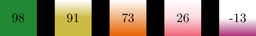
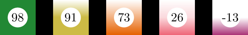
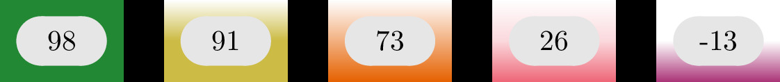
I would be in favor of displaying a single overall count as it is on SE, and indicating the rest by the background color of the overall count, e.g.
- Green: Almost no down-votes
- Orange: Mixed votes
- Red: Negative votes Perhaps the color could represent the Wilson score. The details of the up and down votes (and maybe even the raw Wilson score) could be displayed while hovering above the over count.
Edit: To make the coloring more friendly one of these pallets could be used in addition to shading, e.g. (In this example I assume that there was total of 100 or 101 votes, the difference of up and down votes is displayed):
V1
V2
V3

1 comment thread