Welcome to Codidact Meta!
Codidact Meta is the meta-discussion site for the Codidact community network and the Codidact software. Whether you have bug reports or feature requests, support questions or rule discussions that touch the whole network – this is the site for you.
Comments on Taking our design to the next level: feedback wanted
Parent
Taking our design to the next level: feedback wanted
Our team has been exploring some ideas to improve Codidact's design. We've wanted to improve the visual design for a while, and we also have a lot of other usability changes we'd like to make. We want visual design and function to complement each other, creating a more intuitive and pleasant experience for our community members and visitors. Everything's interconnected, which has made it hard to just do that one thing now, so our design team has been working on a mockup that shows several ideas together. We'd like your feedback.
We're starting with the "post list", the list of (usually) questions on the main page of a community or any of its categories. By moving a few things around and changing the visual emphasis of certain elements, we think this new design is easier to scan and easier to interact with, whether you're looking at a list of questions or a list of recipes or a community's blog. Please check out a live mockup. Note that the design is live but data is static, not all buttons do something (but they hint at what you'd see), and you can't really go to other pages.
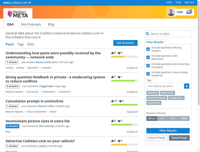
Color is used more sparingly in this design, with the eye drawn to unanswered questions and the "ask" button (which is now in line with the list of questions rather than all the way to the right). The design supports header banners beyond just the logo, which we think will allow communities to express more of their identity. That orange stripe is a placeholder, to be replaced with whatever each community wants to use to convey itself visually.
The structure of categories -- a row showing the categories, description and category-specific controls below those tabs, post list below that -- is preserved with some tweaks. As you can see, we've moved the voting information to the right and decreased the size of the numbers. Both the numbers (raw data) and the score scale are shown, supporting different modes of taking in information. For some people, the "temperature" bar is the best way to convey information. For those who want a closer look, the raw numbers are still there. We'll keep the tooltips we have now (or improve them); we're not taking away guidance.
Tags are styled differently in an effort to be present and visible without necessarily being in your face. We've given titles a little more breathing room, but we think this still allows for a reasonable number of questions to be shown together.
The "expand" control is new; it allows you to see a quick summary of the page (in a pop-out modal) from right there on the post list. It'll show you the opening lines of the question and a summary of answers, sort of like the table of contents that's available on question pages. (That TOC part isn't there in the mockup now.) For posts that aren't questions, like blog posts, it'll still show the opening lines.
Sorts, filters, and search move into the right column to be "closer" to the things being sorted/filtered/searched. Eventually we envision real user-defined filters, so you can define something that shows you only questions in these tags with fewer than N answers, or posts in all categories meeting some other criteria, or only unanswered questions, or other things yet to be thought of. We haven't designed this filtering system yet (and we'll be asking for your input on what you'd like to have before we do so), but this is where it would plug in and what it could look like. Filters are kind of like named searches, so it made sense to us for search and filters to be together on the page. We think the current sorts (Activity, Votes, etc) probably fit in here too, though we grant that filters (restrict what you show) and sorts (show the same things in different orders) are not quite the same thing.
This design doesn't show the rest of the right column, which we'd like to review separately. For communities that have an important notice (particularly relevant for certain professions), this notice will remain prominent at the top of the column. Other stuff, like featured posts, ads, selected questions, the chat and advertising links, and so on -- that stuff's all subject to more review later, and ultimately we think communities should decide what shows up there. We're also hoping to use that space sometimes for contextual information -- for example, formatting help when you're creating or editing a post.
The design is responsive; try changing your window size to see how it looks for different form factors.
We've been tossing around low-end sketches (Paintbrush is my friend...) with circles and arrows and comments like "clicking here does X". We'd like to thank Matt Brent for turning those vague ideas and his own design experience into a real design that we can now bring to the community for feedback before writing code.
Why are we spending effort on a new design when we have a design that works fine now? Partly to visually distinguish ourselves even more, partly to have a solid foundation for all the things we want to add that were never thought of when the original QPixel code was being written, and partly to empower our communities to customize their presentation along with their content. We think this design helps to highlight the things that are different (we think better) about Codidact. We want communities to be able to build their dreams and we want visitors to see what is possible, what makes it worth looking around.
Please check out the mockup and use answers here to tell us what you like and where you see issues or have suggestions. We want your feedback and constructive criticism so we can all work together to build an even better Codidact.
Keep the bidirectional score bar I personally prefer the current bidirectional score bar over the proposed one. It al …
4y ago
Keep special styling for top level and moderator tags (Top level being the blue discussion, feature-request, bug, and …
4y ago
Don't call it "expand", call it "preview" Minor detail, but since the purpose of that feature seems to be to preview …
4y ago
Keep the "expand"/"preview" action link in place Another small detail, but something that has a tendency to annoy me. …
4y ago
Hover state changes shouldn't cause elements to change size As an example, try using a mouse on desktop to hover over …
4y ago
Loving the discussion. As the main person responsible for the design I wanted to share my thinking to help inform some f …
4y ago
Emphasize the site name over the network Currently, in the top left corner, where it says `meta.codidact.com`, while …
4y ago
Don't touch my avatar! This was already brought up in a comment, but I want to put it in something that can be voted …
4y ago
Add exclude options for the tag filter Perhaps add a section below the tag include filter so we can quickly and easil …
4y ago
> Color is used more sparingly in this design, with the eye drawn to unanswered questions and the "ask" button (which is …
4y ago
Make another pass over the color choices Just some general observations here... Blue background is used to highlig …
4y ago
I was checking UI/UX in android. I had marked what isn't looking well right now. >ui >Look at following picture. In …
4y ago
I really don't like the change to tags. "...without necessarily being in your face" They need to be in one's face! …
4y ago
Save space for the questions The focus of the site are the questions and answers. Taking over vertical space with hea …
4y ago
Merge the two top bars. Like in Reddit. Reddit header Saves space while still allowing plenty of community customi …
4y ago
I definitely do not appreciate the bigger fonts. This makes much less content displayed at the same time, which is bad e …
4y ago
In my honest opinion, the new look is actually really good. The color palette also seems to do well on the new GUIs you …
4y ago
More phone feedback -- smaller layout issues. For a screenshot see this answer ('cause wow is that huge and I don't wan …
4y ago
I looked at the mockup on my phone. At default zoom this is what I see (in Chrome, in case it matters): Screenshot …
4y ago
Another observation: In the new design, the search bar is on the side, which automatically makes it shorter. Which IM …
4y ago
Post
I definitely do not appreciate the bigger fonts. This makes much less content displayed at the same time, which is bad especially on overview pages. At the current design, two-line titles are the exception. At the new design, they are more like the norm.
Also, I don't like the titles to be in bold font on the overview page. In my opinion, bold should always be used sparingly. Titles in the actual text are sparse, therefore it makes sense to make them bold. Titles on the overview page are the main content, therefore making them bold is IMHO wrong.
Also the fact that the scoring takes much more space isn't to my liking (especially since most of it is whitespace to accommodate the overly long picture bar). And I would prefer to keep it on the left, as that way I do not have to move my eyes across the page to get to it.
Also, I much prefer the current “red to the left, green to the right” bars to the new ones. For one, the current bars get more red the more negative the posting is, while the new bars get more red the less negative the post is (where “negative” means relative to the neutral 0.5 score). Indeed, the most red you get if you are almost neutral. That subconsciously gives the message that the worse posts are less bad (because there's less of the “bad colour”).
Also, the header in the new design is basically empty space (indeed, ironically, for my page width — which is actually less than the screen width — it only has content where the content has whitespace (on the left and right), see image:
I'm also missing the Featured/Hot Posts box. And the page somehow aprubtly ends, as opposed to the footer information in the current design (and I cannot find the essential information contained there anywhere in the new design, in particular the terms of service, about us and contact links).
What I do like, however, is the new functionality. I appreciate that instead of the unspecific “last activity” the type of activity is given (new comment, new answer, …). The “expand” button is also nice (though I think it shouldn't move when turning into “close”). And of course the filters are a great addition, although the filter criteria need some work (e.g. instead of excluding questions with downvotes, it would make more sense to exclude questions with more downvotes than upvotes, that is, with “negative” score).
BTW, unrelated to the redesign I'm now wondering if instead of using the Wilson score directly, it would make sense to use (2*Wilson score − 1) as public score. The ordering would be the same (that is, the actual score handing would not need to change, only the presentation to the user), but posts with more downvotes than upvotes would actually get negative score (the score interval would be −1 to 1 instead of 0 to 1).

1 comment thread