Welcome to Codidact Meta!
Codidact Meta is the meta-discussion site for the Codidact community network and the Codidact software. Whether you have bug reports or feature requests, support questions or rule discussions that touch the whole network – this is the site for you.
Taking our design to the next level: feedback wanted
Our team has been exploring some ideas to improve Codidact's design. We've wanted to improve the visual design for a while, and we also have a lot of other usability changes we'd like to make. We want visual design and function to complement each other, creating a more intuitive and pleasant experience for our community members and visitors. Everything's interconnected, which has made it hard to just do that one thing now, so our design team has been working on a mockup that shows several ideas together. We'd like your feedback.
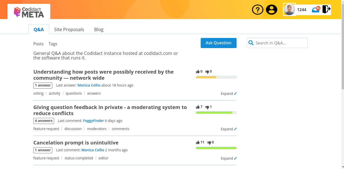
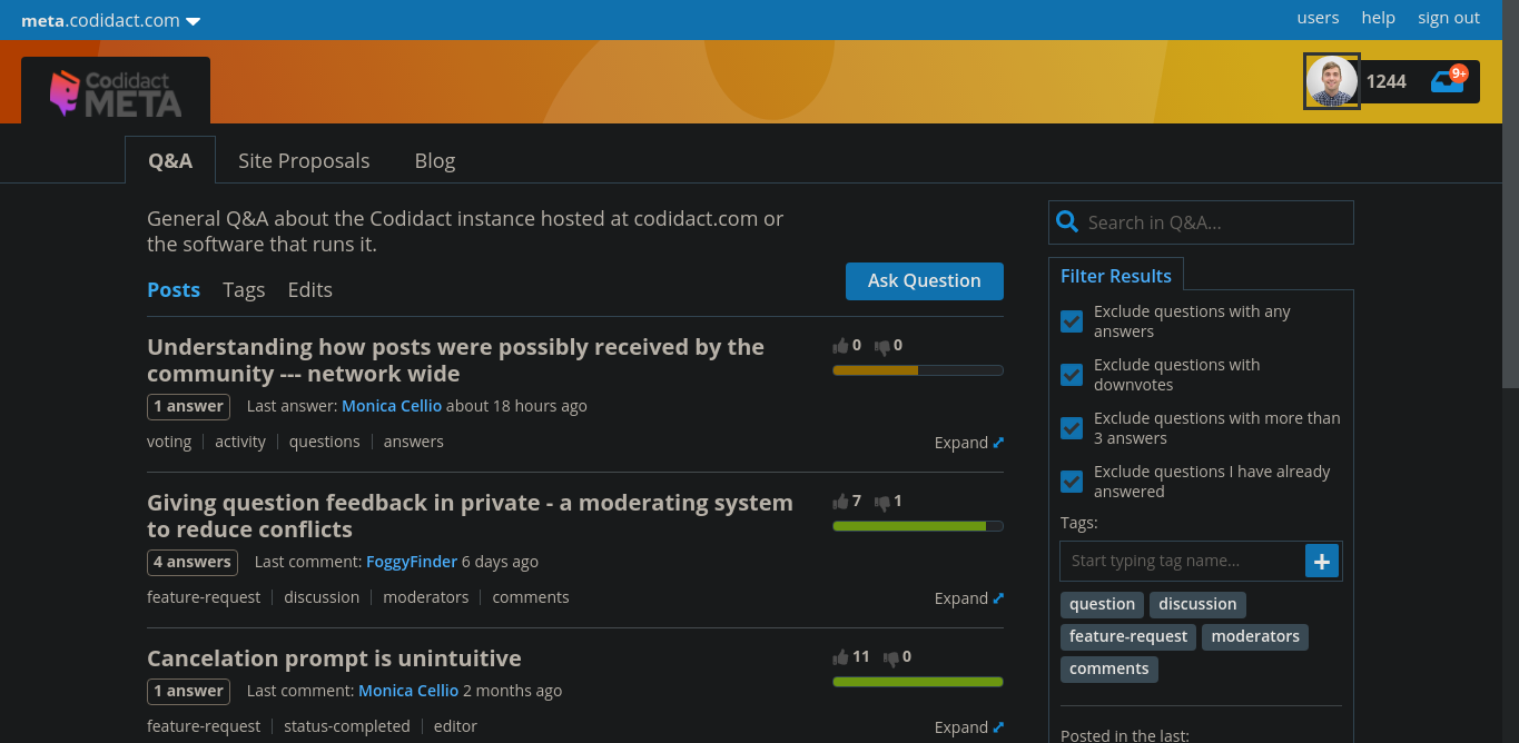
We're starting with the "post list", the list of (usually) questions on the main page of a community or any of its categories. By moving a few things around and changing the visual emphasis of certain elements, we think this new design is easier to scan and easier to interact with, whether you're looking at a list of questions or a list of recipes or a community's blog. Please check out a live mockup. Note that the design is live but data is static, not all buttons do something (but they hint at what you'd see), and you can't really go to other pages.
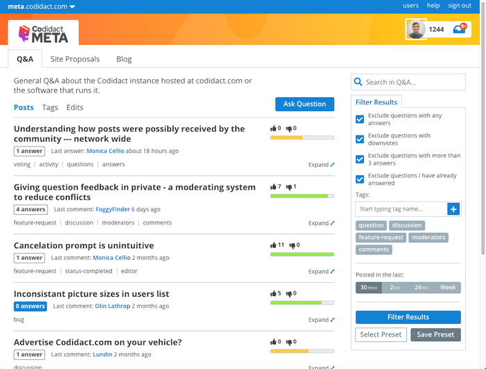
Color is used more sparingly in this design, with the eye drawn to unanswered questions and the "ask" button (which is now in line with the list of questions rather than all the way to the right). The design supports header banners beyond just the logo, which we think will allow communities to express more of their identity. That orange stripe is a placeholder, to be replaced with whatever each community wants to use to convey itself visually.
The structure of categories -- a row showing the categories, description and category-specific controls below those tabs, post list below that -- is preserved with some tweaks. As you can see, we've moved the voting information to the right and decreased the size of the numbers. Both the numbers (raw data) and the score scale are shown, supporting different modes of taking in information. For some people, the "temperature" bar is the best way to convey information. For those who want a closer look, the raw numbers are still there. We'll keep the tooltips we have now (or improve them); we're not taking away guidance.
Tags are styled differently in an effort to be present and visible without necessarily being in your face. We've given titles a little more breathing room, but we think this still allows for a reasonable number of questions to be shown together.
The "expand" control is new; it allows you to see a quick summary of the page (in a pop-out modal) from right there on the post list. It'll show you the opening lines of the question and a summary of answers, sort of like the table of contents that's available on question pages. (That TOC part isn't there in the mockup now.) For posts that aren't questions, like blog posts, it'll still show the opening lines.
Sorts, filters, and search move into the right column to be "closer" to the things being sorted/filtered/searched. Eventually we envision real user-defined filters, so you can define something that shows you only questions in these tags with fewer than N answers, or posts in all categories meeting some other criteria, or only unanswered questions, or other things yet to be thought of. We haven't designed this filtering system yet (and we'll be asking for your input on what you'd like to have before we do so), but this is where it would plug in and what it could look like. Filters are kind of like named searches, so it made sense to us for search and filters to be together on the page. We think the current sorts (Activity, Votes, etc) probably fit in here too, though we grant that filters (restrict what you show) and sorts (show the same things in different orders) are not quite the same thing.
This design doesn't show the rest of the right column, which we'd like to review separately. For communities that have an important notice (particularly relevant for certain professions), this notice will remain prominent at the top of the column. Other stuff, like featured posts, ads, selected questions, the chat and advertising links, and so on -- that stuff's all subject to more review later, and ultimately we think communities should decide what shows up there. We're also hoping to use that space sometimes for contextual information -- for example, formatting help when you're creating or editing a post.
The design is responsive; try changing your window size to see how it looks for different form factors.
We've been tossing around low-end sketches (Paintbrush is my friend...) with circles and arrows and comments like "clicking here does X". We'd like to thank Matt Brent for turning those vague ideas and his own design experience into a real design that we can now bring to the community for feedback before writing code.
Why are we spending effort on a new design when we have a design that works fine now? Partly to visually distinguish ourselves even more, partly to have a solid foundation for all the things we want to add that were never thought of when the original QPixel code was being written, and partly to empower our communities to customize their presentation along with their content. We think this design helps to highlight the things that are different (we think better) about Codidact. We want communities to be able to build their dreams and we want visitors to see what is possible, what makes it worth looking around.
Please check out the mockup and use answers here to tell us what you like and where you see issues or have suggestions. We want your feedback and constructive criticism so we can all work together to build an even better Codidact.
Keep the bidirectional score bar I personally prefer the current bidirectional score bar over the proposed one. It al …
4y ago
Keep special styling for top level and moderator tags (Top level being the blue discussion, feature-request, bug, and …
4y ago
Don't call it "expand", call it "preview" Minor detail, but since the purpose of that feature seems to be to preview …
4y ago
Keep the "expand"/"preview" action link in place Another small detail, but something that has a tendency to annoy me. …
4y ago
Hover state changes shouldn't cause elements to change size As an example, try using a mouse on desktop to hover over …
4y ago
Loving the discussion. As the main person responsible for the design I wanted to share my thinking to help inform some f …
4y ago
Emphasize the site name over the network Currently, in the top left corner, where it says `meta.codidact.com`, while …
4y ago
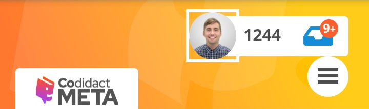
Don't touch my avatar! This was already brought up in a comment, but I want to put it in something that can be voted …
4y ago
Add exclude options for the tag filter Perhaps add a section below the tag include filter so we can quickly and easil …
4y ago
> Color is used more sparingly in this design, with the eye drawn to unanswered questions and the "ask" button (which is …
4y ago
Make another pass over the color choices Just some general observations here... Blue background is used to highlig …
4y ago
I was checking UI/UX in android. I had marked what isn't looking well right now. >ui >Look at following picture. In …
4y ago
I really don't like the change to tags. "...without necessarily being in your face" They need to be in one's face! …
4y ago
Save space for the questions The focus of the site are the questions and answers. Taking over vertical space with hea …
4y ago
Merge the two top bars. Like in Reddit. Reddit header Saves space while still allowing plenty of community customi …
4y ago
I definitely do not appreciate the bigger fonts. This makes much less content displayed at the same time, which is bad e …
4y ago
In my honest opinion, the new look is actually really good. The color palette also seems to do well on the new GUIs you …
4y ago
More phone feedback -- smaller layout issues. For a screenshot see this answer ('cause wow is that huge and I don't wan …
4y ago
I looked at the mockup on my phone. At default zoom this is what I see (in Chrome, in case it matters): Screenshot …
4y ago
Another observation: In the new design, the search bar is on the side, which automatically makes it shorter. Which IM …
4y ago
20 answers
Keep the bidirectional score bar
I personally prefer the current bidirectional score bar over the proposed one. It allows unscored (0-0) and neutral posts to have zero color, making it more visually neutral to my eye. It also makes negatively scored posts more visually negative, since it goes in the opposite direction of positively scored posts.
0 comment threads
Keep special styling for top level and moderator tags
(Top level being the blue discussion, feature-request, bug, and support tags, and moderator being the red status tags)
Since those tags are special, I'd like them to have special styling in the updated design as well.
0 comment threads
Don't call it "expand", call it "preview"
Minor detail, but since the purpose of that feature seems to be to preview more of a post than just the title, let's just call it preview instead.
It's a simple change and I strongly suspect it will make it more obvious at a glance what the function does.
Keep the "expand"/"preview" action link in place
Another small detail, but something that has a tendency to annoy me. If I click on "expand" for a question, it does indeed expand to show more text, but then I have to move to "close" it again.
If I am unlucky, I even have to scroll to do that.
Try to keep that action link in place, such that if I click twice without moving the mouse in between the clicks, I get back to the same view I had previously.
0 comment threads
Hover state changes shouldn't cause elements to change size
As an example, try using a mouse on desktop to hover over some of the tags in the questions with more than one tag.
The change of font weight (normal to boldface) causes the text to change size, which can potentially lead to a whole section of the page reflowing to accomodate the difference. Besides the fact that this causes other parts of the page to shift position, it can also be visually jarring.
I believe that as a general rule of thumb, if hovering changes visual state, those changes should be restricted to visuals that don't cause a change in the size of an element with typical rendering. So things like colors, text decoration and so on are fair game, but font size, weight, etc., are poor choices.
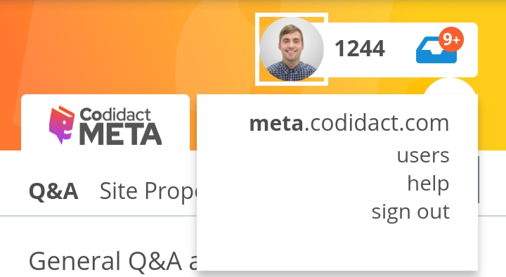
Emphasize the site name over the network
Currently, in the top left corner, where it says meta.codidact.com, while the site name portion ("meta") is in boldface, it's also in a slightly smaller typeface. (Looking at the CSS, apparently 15 px vs 16 px. This is enough of a difference to be clearly discernable.)
If there is any difference in font size between the two parts of the FQDN, it really should be the other way around.
Loving the discussion. As the main person responsible for the design I wanted to share my thinking to help inform some further discussions.
The biggest thing for this redesign was to focus on the few things that are really important to those of us who started and are maintaining Codidact and also (more importantly) the communities themselves, of which you are all a part of.
Our biggest focus for the design were:
- focus on keeping the quality of questions high
- maximizing customization of instances without compromising the aesthetic of the site
- Adding more consideration to the weightings and what makes up a post in the post list
- Creating space and increasing font sizes to aid legibility (not everyone can see 8px fonts). This will include a move to other design decisions that make the sites more accessible
- optimizing for mobile without compromising desktop
- Using color more consistently but not everywhere
Not all of the features are fully baked yet, we are simply providing some initial ideas and we are hoping to spark conversation with you so that we can ideate and improve these features when we come around to focusing on them (sidebar and filters for eg.).
The more you communicate with us - and the more you vote for things on this page that are important to you, the easier it is for us to make the right decisions that impact the most amount of users in a positive way.
Thanks for being so awesome Codidact communities :)
0 comment threads
Don't touch my avatar!
This was already brought up in a comment, but I want to put it in something that can be voted on in its own right.
Let people choose their avatars themselves, including whether they want them to appear as circular, oval, square, rectangular, triangular, trapezoid, with sharp or rounded corners, or whatever other shape happens to strike their particular fancy. (Including using transparency to create the appearance of arbitrary shapes.)
Also, as a minor aside but very much related to the issue of avatar shape, please do test with non-square-ish avatars as well and make sure that those render correctly in all places where avatars are displayed.
Just to be clear: if at some point we want to offer the possibility of on-site cropping of an arbitrary avatar to, say, a circular shape, that's different, and not something I am arguing against here, because that's a choice. But short of outright offensive shapes, which probably can't be reliably detected in software anyway without significant work, please don't force any particular avatar shape on users. It's bad enough that big-name social media sites seem to go out of their way to do that already.
Add exclude options for the tag filter
Perhaps add a section below the tag include filter so we can quickly and easily exclude specific tags from our searches. (Typing out a full tag:bug -tag:status-completed is both cumbersome and requires knowledge of search syntax)
0 comment threads
Make another pass over the color choices
Just some general observations here...
Blue background is used to highlight that a question has no answers, but also for action buttons (ask question, filter results, ...), but not all of them (select preset, save preset), let alone action or navigation links (expand, tag names, category names, ...).
Mid-gray background with white text is used for tags, but only in the filter dialog, and for unselected choices in one-out-of-many ("posted in the last"), but not for all of them (compare the posts/tags/edit triad).
Strongly blue text is used to highlight the username of the user who has the most recent activity on a post (which looks like it's supposed to link to something), but apparently not much else, making it stand out quite a bit from pretty much everything else on the page. Is the username really that important?
Please don't get me wrong; some amount of color makes for a nice touch to an otherwise very text-centric site, and at least to me (with documented fully adequate color vision) the colors themselves work well together. However, I think the colors of the various elements could benefit from being more clearly chosen to convey meaning, in the sense of "what will happen if I activate this thing?". For example, having two color pairs for buttons (important and less important) might be beneficial, but three (never mind four or more if you include action links that aren't rendered as buttons and the tags in the filtering section) seems excessive.
0 comment threads
Color is used more sparingly in this design, with the eye drawn to unanswered questions and the "ask" button (which is now in line with the list of questions rather than all the way to the right).
Actually I find that the thing which draws my eye is the coloured bar indicating the vote balance. Since the bar is now on the right, this is unhelpful: when I'm scanning a question list for questions of interest I care about the title and the vote balance. To skim the titles I want to directly look at the left of the title and let my peripheral vision and unconscious eye movement take in the rest; in the old design, this keeps the vote balance within peripheral vision as well.
I was checking UI/UX in android. I had marked what isn't looking well right now.
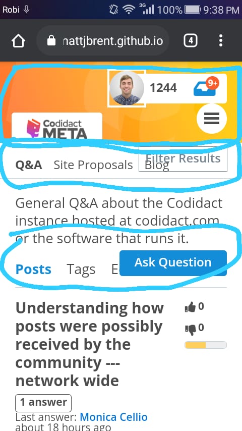
Look at following picture. In Desktop, we can see lot of sites link in Desktop. While, android is only showing Codidact Meta.
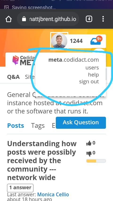
So, there's some issue is available in above UI. The UI is completely looking good in Iphone 6,7,8 Plus IOS 11.
I had earlier worked on it (maybe, 2 months ago). I had made some changes. He didn't response to those PR. So, I am implementing it here. I had messaged in Discord also. He had made some more changes after I PR (In few moments, he changed the UI lot more that's why I didn't message).
Here's how the UI looks like
I didn't have any better icon that's why I just used those. If people likes the UI. Than, I will work on it again :) .
The one last thing I want in this UI that is color. The color isn't looking beautiful. But, when I use Dark Reader(Mithical mentioned in Discord) the top bar is looking good. But, without Dark Mode it's very dirty (That's what I think. It may be beautiful for someone else also).
That's why I think if he changes the color of top bar than it may be good.
0 comment threads
I really don't like the change to tags. "...without necessarily being in your face" They need to be in one's face!
The way these kind of Q&A sites are designed, tags are super important. They need to work as a head's up of what the post is about and what knowledge that might be required in order to answer it.
Otherwise, and I know this by experience, people without the necessary domain knowledge will end up answering questions that they shouldn't answer. Or post blatantly off-topic answers. I don't know how many times I've had a situation at SO where I have to leave a comment "you realize this is tagged x, right?" on some answer. And oops, they hadn't noticed. This on a system with much more prominently displayed tags than what was proposed here.
Please don't implement the change of tag appearances, I think you'll be making a big mistake.
Merge the two top bars. Like in Reddit.

Saves space while still allowing plenty of community customization.
This is a crude example of what I mean. Position of elements could possibly differ and of course the text I copy pasted is not meant to have a different background.

Regarding Monica's comment. This is how Reddit looks on a phone in portrait mode:

Indeed there is not enough space to fit what we can see in a desktop computer. And it is the same in landscape mode despite there being enough space for more. They probably did not think it was worth the effort.
I have to agree with Monica. A design which works everywhere is more important.
But are you using the same design everywhere? This is the mockup I get in an Android Samsung XCover 4S model SM-G398FN (1280 x 720) using Chrome:
The top blue bar is nowhere to be seen and its functionality has been replaced by the circular button with 3 bars.
If you are using different designs for smartphones than for desktops then for smartphone I would propose this for smartphones:
The triangle pointing down would have the same popup menu as the three bars icon. A three bar icon might be better because it is more common. As seen before Reddit also uses a three bar icon. The icon is not a relevant part of my proposal. The main point is a more compact design without loosing functionality or readability.
And yet another proposal which removes reputation and recovers the hamburger menu. Here the down arrow function is only to change community:

Save space for the questions
The focus of the site are the questions and answers. Taking over vertical space with headers and such creates a need for a larger amount of scrolling to get to content on every page. Please do it sparingly.
In the current scheme, I can see 4 questions without scrolling. With the new scheme, I can only see 3.
Proposals that help in this regard have already been given, but still I found it important to generalize this goal for voting on its own right.
I definitely do not appreciate the bigger fonts. This makes much less content displayed at the same time, which is bad especially on overview pages. At the current design, two-line titles are the exception. At the new design, they are more like the norm.
Also, I don't like the titles to be in bold font on the overview page. In my opinion, bold should always be used sparingly. Titles in the actual text are sparse, therefore it makes sense to make them bold. Titles on the overview page are the main content, therefore making them bold is IMHO wrong.
Also the fact that the scoring takes much more space isn't to my liking (especially since most of it is whitespace to accommodate the overly long picture bar). And I would prefer to keep it on the left, as that way I do not have to move my eyes across the page to get to it.
Also, I much prefer the current “red to the left, green to the right” bars to the new ones. For one, the current bars get more red the more negative the posting is, while the new bars get more red the less negative the post is (where “negative” means relative to the neutral 0.5 score). Indeed, the most red you get if you are almost neutral. That subconsciously gives the message that the worse posts are less bad (because there's less of the “bad colour”).
Also, the header in the new design is basically empty space (indeed, ironically, for my page width — which is actually less than the screen width — it only has content where the content has whitespace (on the left and right), see image:
I'm also missing the Featured/Hot Posts box. And the page somehow aprubtly ends, as opposed to the footer information in the current design (and I cannot find the essential information contained there anywhere in the new design, in particular the terms of service, about us and contact links).
What I do like, however, is the new functionality. I appreciate that instead of the unspecific “last activity” the type of activity is given (new comment, new answer, …). The “expand” button is also nice (though I think it shouldn't move when turning into “close”). And of course the filters are a great addition, although the filter criteria need some work (e.g. instead of excluding questions with downvotes, it would make more sense to exclude questions with more downvotes than upvotes, that is, with “negative” score).
BTW, unrelated to the redesign I'm now wondering if instead of using the Wilson score directly, it would make sense to use (2*Wilson score − 1) as public score. The ordering would be the same (that is, the actual score handing would not need to change, only the presentation to the user), but posts with more downvotes than upvotes would actually get negative score (the score interval would be −1 to 1 instead of 0 to 1).
In my honest opinion, the new look is actually really good. The color palette also seems to do well on the new GUIs you guys have. I wonder what's in stock for such a design like this for the other sites, not just the Meta site like what's displayed here.
As for changes, there's really nothing I want to change in it, as it looks quite perfect, but I do agree with many of the other answers asking for changes.
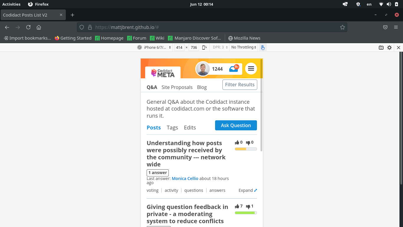
I looked at the mockup on my phone. At default zoom this is what I see (in Chrome, in case it matters):
Screenshot
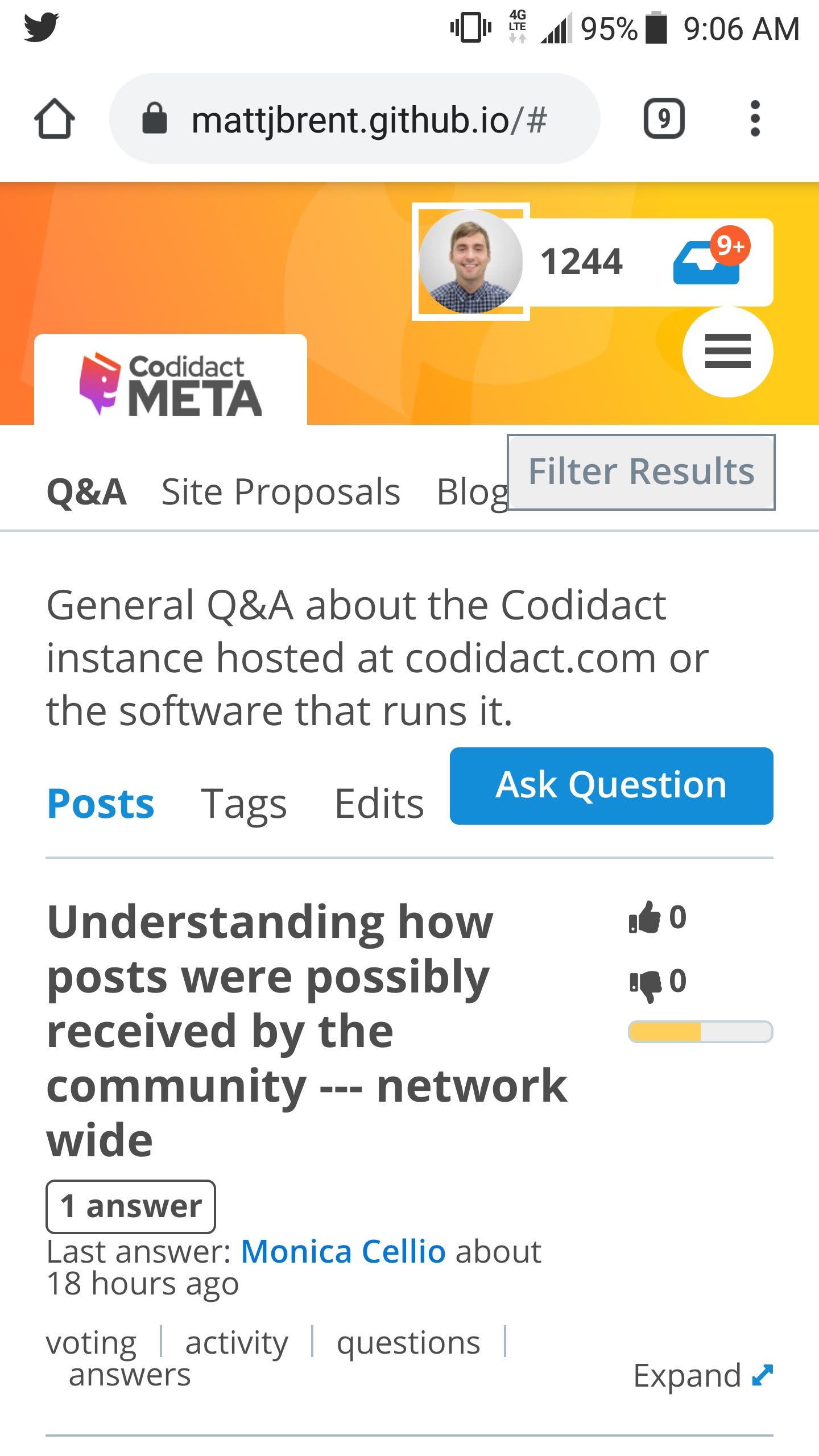
Focusing on the question list (for this answer):
-
With the amount of stuff at the top and the size of the titles, I see only one question. That seems unfortunate.
-
Part of that is due to the title width being constrained. For a small screen could we do something else with the currently horizontal thermometer? Maybe make it vertical, or smaller, or collapse down to just color (so you get only three states and can't see how green or red something is)? I'm not sure what would be best here, but I'd like titles to have more of the width.
-
From the way the tags, "N answers", and "last activity" parts are flowing, it looks like reducing the width of that area would also improve these. I guess we can't flow text into that empty space under the thermometer? Another reason to reduce the width it consumes.
-
Space is tight on the "last activity" line; "~" instead of "about" might make the difference.
-
Another area grabbing space is the category description. (This is true for the current design too.) Especially on a smaller screen, and perhaps more generally, I wonder if we should make that collapsible -- maybe show it until the user dismisses it (so you'd need a cookie, I think), and when it's dismissed, add something that the user can tap/click to see it again. Even though it's at a different "level", maybe the hamburger menu is an ok place to add "category description" to toggle it back on? Or maybe some sort of TBD icon on the category row?
More phone feedback -- smaller layout issues. For a screenshot see this answer ('cause wow is that huge and I don't want to do that on a second answer).
-
I'm glad to see that the "filter results" button is visible and not just lost to "that column goes to the bottom in a responsive design". (No one will see it there.) Its placement isn't quite working with the category list, though, and this is on a community that only has three -- so while here you could nudge it rightward and be ok, on a community with more, or with categories with longer names, that won't work. If "Ask Question" became "Ask" (or a generic "Post"), would there be room for a "Filter" button next to it? (Might need to make the text a little smaller, but for single-word UI controls with good contrast that seems ok.)
-
I agree with another answer that the header layout seems a little off on a phone. I know we're trying to leave room for a banner graphic, but the parts of that banner that would be visible on desktop are covered on a small screen and vice-versa, so that's already challenging. To save space I'd drop out the reputation number -- show logo on the left and, from the right, hamburger, avatar, inbox, and the banner gets whatever's left between them (not much but the same relative positions as on desktop). Reducing the header height by half would be significant on a phone.
-
I guess it's just because it's more proximate on a phone than on a desktop, but the "Ask Question" button seems to be too high compared to "Posts", "Tags", and "Edits". I realize the bottom of the button background is horizontally aligned with the bottom of those words, but the text being higher than that (because it's in a button) is distracting me.
Another observation:
In the new design, the search bar is on the side, which automatically makes it shorter. Which IMHO is unfortunate. Shorter search bars make it harder to do non-trivial searches.
If you go to SE, you'll see that the majority of the top bar is occupied by the search bar. The same is true for reddit. I think it would also be a good idea for this site.
0 comment threads

1 comment thread