Communities

Writing
Writing
Codidact Meta
Codidact Meta
The Great Outdoors
The Great Outdoors
Photography & Video
Photography & Video
Scientific Speculation
Cooking
Cooking
Electrical Engineering
Judaism
Judaism
Languages & Linguistics
Software Development
Mathematics
Mathematics
Christianity
Christianity
Code Golf
Code Golf
Music
Music
Physics
Physics
Linux Systems
Linux Systems
Power Users
Power Users
Tabletop RPGs
Tabletop RPGs
Community Proposals
Community Proposals
tag:snake search within a tag
answers:0 unanswered questions
user:xxxx search by author id
score:0.5 posts with 0.5+ score
"snake oil" exact phrase
votes:4 posts with 4+ votes
created:<1w created < 1 week ago
post_type:xxxx type of post
Search help
Notifications
Mark all as read See all your notifications »
Q&A

Welcome to Codidact Meta!

Codidact Meta is the meta-discussion site for the Codidact community network and the Codidact software. Whether you have bug reports or feature requests, support questions or rule discussions that touch the whole network – this is the site for you.

Comments on Should we start displaying the score of a post instead of the raw votes?

Parent

Should we start displaying the score of a post instead of the raw votes?

+8
−2

Currently, when viewing a post, Codidact will show you the raw votes on a post, with the breakdown into upvotes and downvotes:

Screenshot of the voting buttons, showing +12 and -1.

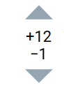
There's been some feedback that this is a bit too much to show, especially coming from platforms like Stack Exchange where they generally just show the aggregate score of upvotes and downvotes as one number (with the option to expand the votes to see the split). We decided to show both counts automatically to better show when there's controversy.

However, we now also have another option. We have a method for scoring posts that assigns a score between 0 and 1 to each post.

Perhaps instead of showing the raw votes on each post, we should instead show the post score (e.g. 0.81363... or 0.3793...), rounded to the nearest two or three decimal places (so that it would show as 0.937 or 0.276), with the raw votes available on request, perhaps either on click or in the tools menu.

This would take people a bit of time to get used to, but it might be worth that initial adjustment time, since this... is our scoring system and we want people to be familiar with it quickly.

This has the added benefit of making it much clearer why answers are sorted the way they are by displaying their score (that's currently computed without being displayed) for everyone to see. The raw votes matter less than the computed score.

History
Why does this post require moderator attention?
You might want to add some details to your flag.
Why should this post be closed?

1 comment thread

Two degrees of freedom (2 comments)
Post
+0
−2

In my view displaying fractional numbers representing an unintuitive measure would be even worse than displaying two integers representing the up and down counts.

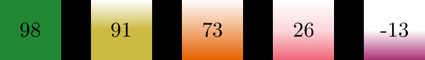
I would be in favor of displaying a single overall count as it is on SE, and indicating the rest by the background color of the overall count, e.g.

  • Green: Almost no down-votes
  • Orange: Mixed votes
  • Red: Negative votes Perhaps the color could represent the Wilson score. The details of the up and down votes (and maybe even the raw Wilson score) could be displayed while hovering above the over count.

Edit: To make the coloring more friendly one of these pallets could be used in addition to shading, e.g. (In this example I assume that there was total of 100 or 101 votes, the difference of up and down votes is displayed):

V1 Illustration of colors and shading

V2 Illustration of colors and shading

V3 Illustration of colors and shading

History
Why does this post require moderator attention?
You might want to add some details to your flag.

1 comment thread

Interesting idea, but poor specific color choices (10 comments)
Interesting idea, but poor specific color choices
Canina‭ wrote over 1 year ago

It's not all that uncommon for people to be red/green color blind; basically, they can't (readily or at all, depending on the severity of their condition) tell the difference between red and green. So using specifically red and green to indicate opposites is a quite poor choice; and in general, IIRC WCAG discourages using color as an only signal of anything.

Pavel Kocourek‭ wrote over 1 year ago

Thanks for bringing this up! How about the Wong or Tol color pallet then? In addition shading could be used, I will edit the post to illustrate.

trichoplax‭ wrote over 1 year ago · edited over 1 year ago

The accessible palettes make an improvement in how distinguishable the colours are (more people will be able to tell them apart) but they do not help with how identifiable the colours are. Many people are already conditioned to see green as good and red as bad, but people who see the accessible palette as, for example, bluish and brownish, will have to learn from scratch which one of those means good, and even then that knowledge is site specific, not a generally applicable rule, as different sites will use different accessible versions of near-red and near-green.

In addition to this, different cultures use colours in different ways, so people who can easily identify red and green will not all associate them with the same meaning.

For this reason, an accessible colour palette is an important start, but is not sufficient alone. As Canina mentions, using colour as the only indicator is not enough. There should also be another indicator such as shape or pattern to supplement it.

trichoplax‭ wrote over 1 year ago

Also worth bearing in mind that having some of the info available on hover makes it difficult or impossible to access on a mobile device. That's already a problem with the existing state though, not specific to your suggested improvement.

Pavel Kocourek‭ wrote over 1 year ago

In the picture that I added to the post I suggest that besides colors there would be shading used: 100% votes up would mean the whole box is shaded, the less % of the total of the votes is up (resp. base this on Wilson score if you will), then the smaller is the shaded part. So in case of the down-votes dominating only the very bottom would be shaded (by magenta color) and the rest of the box would be white.

trichoplax‭ wrote over 1 year ago

Ah I see now. Interesting. A separate accessibility issue is the contrast problem of putting the colours behind the text - but that could easily be avoided by having the same colour and shading to the side of the text instead of behind.

Pavel Kocourek‭ wrote over 1 year ago

Could it be like in the picture I just added at the end of the post?

trichoplax‭ wrote over 1 year ago

I like that. (Bear in mind these are just my opinions - I have no more authority than any other voter here.) The only problem I can foresee is when the community grows and there are more votes, some of these may become more than 2 digits and not fit in the circle...

Pavel Kocourek‭ wrote over 1 year ago

Added version 3 to address the issue you mentioned.

Karl Knechtel‭ wrote 5 months ago

The graphic design here doesn't make the shading very obvious, in my opinion. In particular, I think a blurred edge or gradient fill is counterproductive - if the intent was to convey the level of certainty in the Score (i.e., something related to the number of votes informing it), it definitely fails at that task IMO.

It's also visually distracting to show the number on top of this variably-sized, possibly-gradient-filled, region of colour. The number distracts from interpreting the colour block's hue and size; adding a separate shape behind the number makes the number more readable, but the colour block even harder to interpret.

In my design, I attempt to address these problems by showing the number separately and using a pie-shaped wedge for the colour block (so that there's a clear reference for "100% filled"). I also think that if a single number is shown, it should be a sum of up and down votes, not a difference (and explain why in my answer).